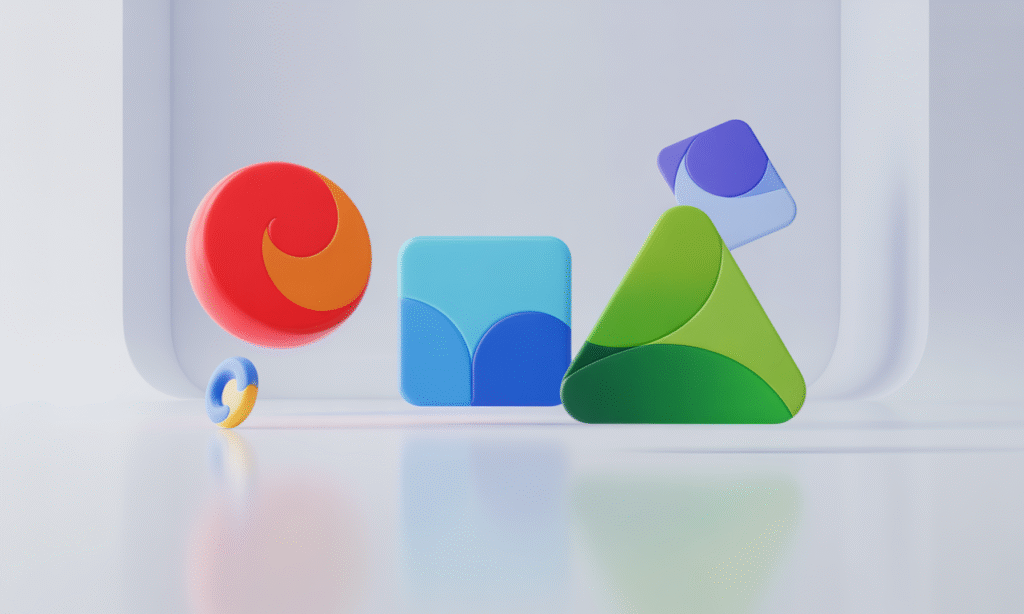
Have you ever looked at a logo and instantly felt something — a sense of trust, curiosity, or excitement?
That’s not just great design at work. That’s logo design psychology in action.
Logos aren’t just visual symbols; they’re emotional connections. Every curve, color, and font choice influences how we perceive a brand — often without us realizing it. Whether you’re building a brand from scratch or refreshing an existing one, understanding how logo design psychology works can help you make smarter design decisions that truly resonate.
Color Psychology in Logo Design
Logo design starts with color. Colors communicate feelings before words do. Each color evokes specific emotions:
- Red → Energy, passion, urgency
- Blue → Trust, calm, professionalism
- Green → Health, nature, balance
- Yellow → Optimism, warmth, playfulness
- Black → Power, sophistication, elegance
- Purple → Creativity, wisdom, uniqueness
Choosing colors isn’t about personal preference — it’s about the emotional impact. Even small shifts in hue can alter how people feel about your brand.
Shape Psychology in Logo Design
Shapes speak their own language. In the realm of logo design psychology, they help define a brand’s personality:
- Circles suggest unity, wholeness, and inclusivity
- Squares and rectangles represent stability and reliability
- Triangles convey energy, direction, and innovation
- Lines influence feelings of strength (vertical) or calm (horizontal)
These shapes create subconscious messages that help people understand your brand’s personality without reading a single word.
Typography: Your Brand’s Silent Voice
Fonts may be silent, but in logo design psychology, they speak volumes. The right typography aligns with your brand’s message:
- Serif fonts feel classic and trustworthy
- Sans-serif fonts feel modern and clean
- Script fonts add elegance or playfulness (used carefully)
Your typography should match your brand’s tone — a critical, yet often overlooked, element of logo psychology.
Why Logo Design Psychology Matters
Your logo is often the first impression of your brand. If it doesn’t connect emotionally, it won’t be memorable. Design grounded in logo design psychology ensures your logo resonates, builds trust, and reflects your core identity.
When visuals are aligned with brand values and audience expectations, the result is powerful and lasting.
That’s why design grounded in psychology makes such a difference. When a logo aligns with your brand’s values and audience expectations, it builds trust and connection.
For brands looking to craft logos that truly reflect their identity, working with experts who understand the psychology behind design can make all the difference.
Key Takeaways
- Colors evoke emotion — choose wisely
- Shapes communicate personality — pick shapes that tell your story
- Fonts set the tone — make sure they match your voice
- Consistency builds trust — align every visual with your brand’s essence
Ready to Create a Logo That Truly Connects?
If you’re developing or refreshing your logo, use these logo design principles as your guide. And for expert support that blends creativity with strategy, the team at Digiverse Studio is here to help — crafting logos that don’t just look great but genuinely connect with your audience.

