
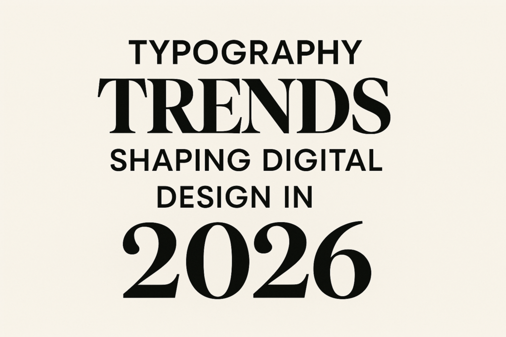
As we look toward 2026, the world of digital design is changing fast. Typography trends are key in this change. Typography is more than just arranging type; it makes things look good and affects how we feel.
By knowing about fonts and modern typefaces, we can connect content with people better. This makes our digital projects stand out. We’ll look at new typography trends that will change how we see and interact with digital content.
We think making things easy to read is very important. It’s what makes design successful. We’re excited to share our thoughts with you.
Key Takeaways
- Typography trends are essential to shaping digital design.
- Fonts significantly influence user experience and engagement.
- Modern typefaces are evolving to meet audience needs.
- Enhancing readability is critical in successful typography design.
- Innovative techniques will redefine visual communication by 2026.
Introduction to Typography Trends
In 2026, we see big changes in typography that show the digital design evolution. Typography trends are leaving old ways behind. They welcome new, contemporary fonts that make things look better and help share messages.
Thanks to new software and web tech, designers can try new things with text. This change lets us break free from old rules. It makes room for more creativity and personal touch in our designs.
It’s key for designers to keep up with typography trends. By updating our skills, we make sure our work speaks to many people. Getting involved in these trends helps us connect with others through design that shows what’s current and popular.

The Impact of Typography on User Experience
Typography plays a big role in making a user experience meaningful. Fonts greatly affect how we see a message or brand. Even small typography choices can change how we feel, shaping our view of the design and engaging us more.
Choosing the right fonts can lead users through content smoothly. This makes their journey through the content more fun.
How Fonts Influence Design Perception
Fonts have a big psychological impact on design perception. Serif fonts often show tradition and reliability. Sans-serif fonts suggest modernity and simplicity.
Knowing this helps brands pick fonts that match their image. For example, elegant script fonts can show luxury. Bold sans-serif fonts can show strength and clarity.
Readability and Its Importance
Readability is key for keeping users engaged on different platforms. Good typography makes sure everyone can read the content, no matter their skills. Using enough space between lines, the right font sizes, and contrasting colors helps a lot.
Typography should focus on being clear. This lets users easily get the information they need. This makes the user experience better overall.

Emerging Fonts for Digital Design in 2026
Digital design is changing fast, and new fonts are key to how we see things. These fonts have special qualities that make them stand out. They look good and are easy to read, making our online world better.
Distinctive Characteristics of Modern Typefaces
Modern fonts have unique features that fit today’s design needs. They often use geometric shapes for balance and neatness. Also, they have better spacing between lines, making text easier to read.
These fonts are simple yet interesting. They work well in many digital designs.
Popular Typeface Styles to Watch
Looking ahead to 2026, some font styles will be big in design. Sans-serif fonts are popular for their flexibility in both print and digital. Display fonts, with their fancy touches, are great for logos and ads.
Variable fonts are also on the rise. They let designers change a font’s look easily. This opens up new creative possibilities.

Minimalism in Typography
In digital design, minimalism is a big deal, and it’s huge in typography. It’s all about keeping things simple. Designers aim to make their work more impactful by choosing less. This results in designs that look great and work well, making things clear and engaging for users.
Why Less is More in Digital Design
Minimalist typography is all about being simple and effective. It uses less clutter and more space to focus on important messages. This makes it easier for people to understand what’s important without getting lost in too much information. In today’s world, where there’s a lot to look at, minimalism offers a clean and engaging way to communicate.
Examples of Minimalist Typography
Many big brands and projects have used minimalist typography to improve their digital designs. For example, American Apparel uses Helvetica, which is known for its clean lines and clear messages. Apple’s marketing also stands out, using simple fonts to create a sophisticated yet friendly brand image. These examples show how minimalist typography can make designs look better and help messages get across more clearly.

Dynamic Typography in User Interfaces
Dynamic typography is key in modern user interfaces. It brings fluidity and adaptability, making user experience better through movement and interaction. Designers use it to make visual elements that grab attention and help users navigate.
This method makes interfaces more engaging and easier to use. For example, animated text can highlight important info, helping users focus on it. Dynamic typography turns static interfaces into lively, user-friendly spaces.
Exploring this trend shows its value in making interfaces more accessible and user-friendly. It allows text to change based on screen size and user preferences. This makes dynamic typography a must-have for improving digital design.

Responsive Typography: Optimizing for All Screens
In today’s digital world, making text easy to read and look good on all devices is key. We need to make sure our text is clear and attractive on different screens. Using the right techniques for responsive typography helps us create designs that fit all screen sizes and resolutions.
Techniques for Effective Responsive Typography
There are many ways to make text responsive. Using relative units like percentages, ems, and rems keeps our designs flexible. This method helps with screen optimization by letting text change size based on the device. We also use media queries to set font sizes at different points, so text looks right on every screen.
The Role of Fluid Type Sizes
Fluid type takes responsive typography even further. It changes font sizes based on the screen size. Using CSS functions like calc() helps make this change smoothly. Fluid type makes content easier to use on any device, making our digital space more welcoming for everyone.

Typography Trends in Branding
Typography is key in shaping a brand’s identity. The fonts chosen can greatly affect how a brand is seen by people. Looking at today’s typography trends, we see how important font selection is. It helps show a brand’s values and make a lasting impression.
An effective branding strategy often uses unique typography. This helps a brand stand out in the market.
Fonts that Enhance Brand Identity
The right fonts can make people feel certain emotions and strengthen messages. Brands like Coca-Cola and Google show how good font choices can reflect their brand’s spirit. For example, Coca-Cola’s cursive script is timeless and instantly brings to mind the brand. Google’s clean sans-serif fonts show modernity and ease of use.
As typography trends change, brands need to update their font choices. This keeps them relevant and connected with their audience.
Case Studies of Successful Branding Using Typography
Looking at different case studies shows how good typography can shape a brand’s story. Here are a few examples:
- Airbnb: The brand uses a custom typeface to show warmth and a sense of belonging, reflecting its mission of community.
- Netflix: Its bold typography makes it easy to see and use, showing the brand’s dedication to entertainment.
- Starbucks: Choosing a specific typeface creates a sense of familiarity. This builds loyalty among its customers through consistent communication.

Color and Typography: Creating Contrast
In design, color is key in telling stories visually. The mix of color and typography changes how we see and feel about a design. Choosing the right colors can make text easier to read, helping users enjoy the content more.
Knowing color theory is a must for designers. Different colors can change how we see and feel about text. For example, light text on dark backgrounds grabs our attention. But, similar colors can make text hard to see.
To make text stand out, we need to think beyond looks. Here are some ways to make text easier to read with the right colors:
- Use complementary colors to highlight key text elements.
- Employ varying saturations and brightness to create depth in the typography.
- Integrate neutral colors for backgrounds to allow vibrant fonts to stand out.
- Test combinations under different lighting conditions to ensure consistent readability.

By using these strategies, designers can make their work easier to read. Every choice in font color and background matters. It shows that using colors well is essential in creating engaging digital designs.
Typography Trends: Accessibility and Inclusivity
In today’s world, making sure everyone can use digital content is key. This means designing for all users, including those with disabilities. Using fonts that are easy to read is a big part of this effort. It makes sure everyone can enjoy what we create.
Fonts for Readability in Diverse Audiences
Choosing the right font can make a big difference. When we think about making content accessible, we look at a few things:
- Sans-serif fonts, which are great for screens because they’re simple.
- Size and weight, bigger and bolder fonts are easier to read.
- Spacing, having enough space between letters helps with clarity.
Fonts like Open Dyslexic and Arial are made to help people with vision problems. Using these fonts makes digital content more welcoming for everyone.
Understanding the ADA Compliance in Typography
The ADA sets rules for making things accessible. Designers and developers must follow these rules for typography. Here are some important points:
- Text and background must have enough contrast for people with vision issues.
- Text should be easy to resize without messing up the design.
- Interactive parts should be clearly labeled so users know what they do.
Following ADA rules helps make designs more inclusive. It shows respect and dignity for all users. Making digital spaces accessible lets everyone fully participate.
Handwritten and Custom Fonts: Adding Personality
In recent years, custom fonts and handwritten typography have changed digital design. They let designers add a personal touch, making a connection with their audience. We’ll look into why they’re popular and how to use them well, sticking to design principles.
The Popularity of Custom Typography
Custom fonts bring character and authenticity to projects. Many brands use them to stand out. They help share a brand’s values and tone, going beyond usual fonts.
Thanks to Adobe Fonts and Google Fonts, designers have more options. This makes creativity and innovation easier.
Best Practices for Using Handwritten Fonts
To use handwritten fonts well, follow these tips:
- Coherence: Make sure the font fits the brand’s identity.
- Legibility: Use handwritten fonts where they’re clear and make sense.
- Contrast: Mix handwritten fonts with modern ones for balance.
Using these tips will make your designs more appealing. They’ll connect with your audience better.
Layering Text and Images for Impact
In today’s digital world, mixing text and images can make stunning designs. Designers blend impactful typography with images to grab attention and share messages clearly. This mix greatly affects how we see and understand the design.
Combining Typography with Visual Elements
Creating a good mix of text and images is key. Using different colors makes text easier to read while keeping things visually appealing. Bold fonts help important messages pop out, even on busy backgrounds.
Adding space between elements also helps. It makes the design easy to follow and understand.
Techniques for Effective Layering
There are special ways to layer text for more impact. Changing the text’s opacity lets the image behind show, adding depth. Layering text also creates interest, guiding the viewer’s eye.
Drop shadows and outlines help text stand out over complex images. This keeps the text the main focus of the design.
The Future of Variable Fonts in Digital Design
Variable fonts are changing digital design, bringing new flexibility. They let designers adjust type weight, width, and slant. This means designs can be more personal and fit different places and screens.
These fonts also make websites faster. They combine many styles into one file. This cuts down loading times and makes sites work better.
Variable fonts will make design more about the user. They can change to meet the needs of the viewer. This opens up new ways to design for different screens and brands.
In short, variable fonts will shape the future of digital design. They make designs smooth and adaptable, making them key in digital design.
Typography and SEO: Enhancing Visibility
Good typography is key to search engine optimization. It makes content easy to read and keeps users interested. This boosts SEO rankings. Every detail, from font to spacing, impacts how search engines see and users interact with the content.
How Typography Affects SEO Rankings
Typography’s role in SEO is huge. Clear and structured typography keeps visitors on the page longer. The right fonts keep people’s attention, which search engines see as a good sign.
Headings that pop out help guide users and show search engines the content’s structure. This is important for SEO.
Best Practices for Optimizing Typography
To link typography and SEO well, follow these tips:
- Choose fonts that are easy to read on all devices and sizes.
- Use the right line spacing and paragraph breaks for better reading.
- Make a clear content hierarchy with headings and subheadings.
- Ensure text stands out against the background for everyone’s sake.
- Stick to a few fonts to keep things consistent.
Typography Trends in E-commerce Websites
In the world of e-commerce, typography is key. It shapes how we shop online. Good typography makes brands stand out and helps customers find what they need easily.
Choosing the right fonts can make customers trust a site more. It can also influence what they buy and how often. This can lead to more sales.
Create a Seamless Shopping Experience with Typography
Today’s shoppers want a smooth online shopping experience. Typography helps make this happen. By picking fonts that match their brand, retailers can connect with their audience.
Clear headings, easy-to-read product details, and clear calls to action help shoppers navigate. This makes them feel at ease, encouraging them to explore and buy.
Fonts that Drive Conversion
Choosing the right fonts is important for sales. Fonts that look professional and trustworthy make shoppers more likely to buy. Sans-serif fonts are modern and attractive, which is great for e-commerce.
Retailers can use different font sizes and weights to highlight important info. These choices can push customers to add items to their cart or make a purchase.
Typography in Mobile Design: Trends to Follow
As more people use mobile devices, making mobile typography better is key. Designers need to make text easy to read and look good on small screens. This often means looking at new design trends.
Responsive design is all about making text work on different screen sizes. Font sizes, line heights, and spacing between letters must be just right. This ensures text is clear on any device. Designers use fluid typography to make text scale well without losing clarity.
Nowadays, bold fonts are popular because they grab attention without being too busy. These fonts are great for mobile, where users quickly scan content. It’s important to highlight key info with typographic hierarchy.
Also, using lots of white space makes mobile typography more effective. It helps text stand out and makes the design more welcoming. This leads to users spending more time on the site.
In the end, good mobile design depends a lot on typography. Designers should keep up with the latest design trends and adjust their work for responsive design.
Conclusion
As we wrap up our exploration of typography trends for 2026, we see how fonts change how we communicate. Fonts can shape how we see things and make our digital experiences better. They play a key role in how we connect with online content.
Designers must keep up with these trends, focusing on making designs that everyone can enjoy. By using new techniques like minimalism and responsive designs, we can make digital design more exciting. This way, we can make our work more beautiful and useful.
Our work in typography is just starting. As we move forward, let’s use our creativity and stay updated. We should make sure our designs stay fresh and meaningful in the future.