
In today’s design world, knowing how to use color systems is key. Color is vital in UI design, affecting both looks and user experience. It makes things accessible and easy to understand.
This article will show you how to make color palettes that work for everyone. We’ll look at how colors make us feel and the tools we can use. Our goal is to make technology easier and more enjoyable for all users.
Key Takeaways
- Understanding the significance of UI colors in design.
- Implementing accessible color systems to enhance user interactions.
- Developing scalable palettes for efficient design processes.
- Exploring emotional connections associated with color.
- Utilizing practical tools for effective color selection.
Understanding Color Systems in User Interface Design
Color systems in UI design are key frameworks for picking colors for different design parts. They help create a unified look that boosts usability and visual appeal. At the heart of these systems is color theory, which covers hue, saturation, and brightness. Knowing these helps us make color palettes that match our design goals.
A solid color system builds a strong brand identity and keeps the look consistent. This is key for a smooth user experience. Understanding how colors work together and their roles is essential for creating effective UI color systems.
| Aspect | Description | Relevance to UI Design |
|---|---|---|
| Hue | The attribute of colors that allows us to categorize them, such as red, blue, or green. | Determines the overall mood and theme of the design. |
| Saturation | The intensity or purity of a color. | Affects visual vibrancy and can influence user emotions. |
| Brightness | The lightness or darkness of a color. | Impacts readability and user interaction. |
| Contrast | The difference between colors, which can create visual interest. | Essential for accessibility and guiding user attention. |
| Color Harmony | The pleasing interaction of colors, often achieved through complementary or analogous schemes. | Enhances visual coherence within the UI. |

The Importance of Accessible Color Palettes
When we design user interfaces, making them accessible is key. This ensures everyone, including those who are visually impaired, can use apps easily. By using color palettes that meet different needs, we create a welcoming space for all.
Defining Accessibility in UI Design
Accessibility in UI design means making digital products work for people with disabilities. Colors are important here; the right contrast helps users tell things apart. Using accessible colors lets more people enjoy our designs, making it easier for everyone to interact.
Benefits of Accessibility for Users
Using accessible colors helps visually impaired users a lot. It makes navigating easier and improves their experience. It also shows we care about everyone, which is good for our brand.
Plus, following laws like the ADA protects us from legal issues. It also helps build a community among users.

UI Colors: Building a Foundation for Color Choices
Creating an effective user interface starts with understanding the importance of color choices. The color wheel helps us pick harmonious colors. These colors are primary, secondary, and tertiary, each with its own psychological effects.
When we look at foundational colors, we think about both looks and usability. Organizing these colors helps us show our brand’s identity and improve user experience. For example, the right color arrangement can make users feel certain emotions and guide them better.
Knowing how colors relate on the color wheel helps us make smart choices. Using contrasting colors effectively highlights important parts without overwhelming users. This makes our designs more engaging and meaningful.
| Color Type | Example Colors | Psychological Impact |
|---|---|---|
| Primary Colors | Red, Blue, Yellow | Stimulates base emotions, foundational for creating other colors |
| Secondary Colors | Green, Purple, Orange | Adds balance and contrast, creates a sense of harmony |
| Tertiary Colors | Red-Orange, Blue-Green | Enhances depth, adds complexity to the palette |
By using color wheel-based choices, we create designs that are both accessible and attractive. This approach boosts creativity and sets up a solid framework for successful user experiences.
Color Tokens: What They Are and Why They Matter
Color tokens are key in digital design. They help create a unified and lively design language. These tokens mark specific colors for different parts of a user interface. This ensures our color choices stay the same everywhere.
Creating a Consistent Design Language
Using color tokens makes our visual language clear and consistent. Designers and developers can easily understand the color plan. This teamwork boosts collaboration and cuts down on mistakes.
With color tokens, we lay a solid base for a great user experience.
Implementing Color Tokens in Your Design Process
Adding color tokens to your design flow makes color use easier across different platforms. Begin by making a detailed list of color tokens. Link each token to its color in a style guide. Use design tools to apply these tokens in your designs or prototypes.
This makes updates smooth and keeps your design looking good as your project grows.

| Token Name | Hex Value | Usage Example |
|---|---|---|
| Primary Color | #3498db | Background of buttons |
| Secondary Color | #e74c3c | Alert messages |
| Accent Color | #f1c40f | Highlights and notifications |
| Neutral Color | #2c3e50 | Text and borders |
Choosing the Right Colors for User Experience
Colors in user interface design greatly affect how users feel and act. Knowing about color psychology helps us see how different colors can make people feel certain ways. By picking colors wisely, we make our products more fun and useful for users.
Emotional Responses to Colors
Colors talk to us without words and can make us feel different things. Warm colors like red and orange make us feel excited and full of energy. Cool colors like blue and green calm us down and make us feel peaceful. It’s key to choose colors that match what we want our users to feel.
Color Selection Tools and Resources
Using color selection tools makes picking the right colors easier. These tools help designers find colors that work well together and follow color psychology rules. There are many resources out there, like color wheel apps, online palette makers, and tools that check if colors are accessible to everyone.
| Color | Emotional Response | Usage in UI |
|---|---|---|
| Red | Excitement, Passion | Alerts, Call-to-action Buttons |
| Blue | Trust, Calmness | Information Displays, Backgrounds |
| Green | Health, Growth | Success Messages, Nature-Related Themes |
| Yellow | Happiness, Energy | Highlights, Notifications |

Understanding Contrast Ratio for Better Accessibility
The contrast ratio is key in user interface design. It shows how different text and background colors are. It’s very important for web accessibility because it helps users read and use content easily. Following contrast ratios makes the web better for everyone, but it’s a big help for those with vision problems.
Calculating Contrast Ratios
To figure out the contrast ratio, we look at the relative luminance of colors. The formula is:
(L1 + 0.05) / (L2 + 0.05), where:
- L1 is the lighter color’s luminance
- L2 is the darker color’s luminance
The Web Content Accessibility Guidelines (WCAG) say we need a contrast ratio of at least 4.5:1 for regular text. For large text, it’s 3:1. These ratios help make sure everyone can see things clearly, no matter the device or light.
Tools for Testing Contrast Ratios
There are many tools to check contrast ratios and make sure we follow WCAG rules. These tools let us put in color values and see if they’re accessible right away. Some popular ones are:
- Color Safe: It’s easy to use and helps create color palettes that are okay for everyone.
- WebAIM Contrast Checker: This tool makes it simple to check if colors have the right contrast ratio.
- Contrast Ratio by Lea Verou: It’s a quick way to find out the contrast ratio of colors.
Using these tools helps us make websites that are welcoming to everyone. It makes the web a better place for all users.

Creating Scalable Color Palettes
In the world of user interface design, scalable color palettes are key. They make sure our designs stay flexible and consistent. By focusing on design scalability, we can adjust our color schemes as projects change. This approach not only improves UI consistency but also makes maintenance easier as projects grow.
Benefits of Scalability in Design
Scalability in design helps keep a consistent look across different platforms. Some main benefits are:
- Consistency: A good color palette keeps the UI the same on all devices and apps.
- Efficiency: With a scalable approach, adding new design elements is quicker, saving time.
- Flexibility: Designers can add new features without changing the overall look, encouraging creativity.
Strategies for Developing Scalable Palettes
To create scalable color palettes, consider these strategies:
- Define a Core Palette: Begin with a basic color palette that can grow while keeping a unified look.
- Use Neutrals Wisely: Add neutral shades that go well with core colors, making the design more versatile.
- Establish Guidelines: Create rules for color use, so everyone keeps the UI consistent.

Implementing a Color Hierarchy in UI Design
Creating a strong color hierarchy is key to better user experience in UI design. This UI design strategy uses colors to guide users’ attention. By setting up a clear color order, we make it easy to see what’s important, helping users move smoothly through digital spaces.
Colors do more than just look good; they help with navigation too. By using the same colors for similar things and changing their brightness, we make it easy for users to follow. Important actions stand out, making it clear what to do next. This clear visual plan makes the design more focused on the user, leading to better interactions.
Let’s look at how a good color hierarchy works in different situations. Here’s a table showing how different colors affect what users see:
| Color Usage | Perceived Importance | User Engagement Level |
|---|---|---|
| Bright Red for Alerts | High | High |
| Calm Blue for Information | Medium | Moderate |
| Gray for Background | Low | Low |

Using these color rules in our design work makes for more engaging experiences. By mixing beauty with usefulness, our color choices create designs that connect with users. This leads to meaningful interactions on all platforms.
Best Practices for Color Usage in User Interfaces
Using colors wisely is key to keeping users engaged and strengthening your brand. Using the same colors everywhere helps users link your brand with certain colors. This makes your brand more familiar and trustworthy.
Consistency and Brand Identity
Using the same colors makes your brand stronger and improves user experience. Brands like Coca-Cola and Facebook use consistent colors to create specific feelings. This builds loyalty and leaves a lasting impression.
Responsive Design Considerations
Today’s user interfaces need to work well on all devices and sizes. Colors must look good in different lighting and on various screens. A flexible color system ensures your visuals stay impactful, no matter the device.

Tools and Resources for Color System Development
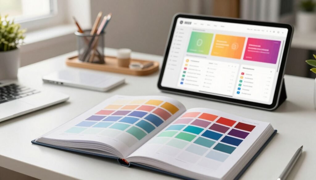
Many tools and resources help in creating effective color systems. Design tools like Figma and Sketch offer features for color management. They let us make, test, and improve our palettes quickly, which is key in UI development.
Using specific color system resources can make our design work better. For instance, Adobe Color and Coolors help create colors that work well together and follow accessibility rules. These tools make picking colors easier and help us follow UI development best practices.
By using these design tools and resources, we can make interfaces that users love. As we keep improving our color system development, these technologies will boost our creativity and speed in making great user experiences.
Case Studies: Successful Color System Implementations
Looking at color system case studies shows how companies use color to improve user experience. These stories highlight the power of color in keeping audiences engaged. They offer insights for our own design work.
Examples from Leading Companies
Spotify and Airbnb are great examples of brands that get color right. Spotify’s bright colors make its music platform pop. It uses colors that match its innovative vibe and is easy for everyone to see.
Airbnb, though, goes for warm colors that make users feel at home. These colors fit perfectly with Airbnb’s goal of connecting travelers with special experiences.
Lessons Learned from Color System Designs
These success stories teach us a lot about color and user experience. A good color system makes sure everyone can use it, no matter their vision. Listening to what users say helps make designs that everyone can enjoy.
Also, using the same colors everywhere helps build a strong brand. It makes the brand look consistent and clear in every visual experience.
| Company | Color Strategy | Impact on User Experience |
|---|---|---|
| Spotify | Vibrant, bold colors | Engaging users and making a strong emotional connection with music |
| Airbnb | Warm, inviting tones | Building trust and comfort among users |
| Dropbox | Clean, simple palette | Making file sharing clear and easy to use |
Testing Color Accessibility with Users
It’s key to check our design choices by testing them with users. This ensures our designs are accessible to everyone. By getting feedback from users, we can make our designs better for all.
Methods for User Testing
- A/B Testing: We compare two color schemes to see which one is better. This helps us know what users like and can see.
- Focus Groups: We bring together different people to talk about colors. This helps us understand how colors affect everyone.
- Usability Testing: We watch how users use our designs. This tells us if they can see colors well and move around easily.
Gathering Feedback for Improvement
After testing, getting feedback from users is very important. We need to listen to what they say to make our designs better. Here’s how we get that feedback:
- Surveys: We use online surveys to see what users think of our colors. It helps us know if they’re happy with what we’ve done.
- Interviews: We talk to users one-on-one. This lets us understand their personal experiences and what they like.
- Analytics: We look at how users interact with our designs. This helps us find out if there are any color problems.
Future Trends in Color Systems for UI
As we look into the future of UI design, new trends are changing how we use color. Dynamic color systems are becoming popular. They change colors based on what the user likes and the environment.
AI is also playing a big role. It suggests colors based on how users act. This makes interfaces more personal and fun for everyone.
Users want more than just good looks from their interfaces. They want them to show their style and mood. Designers are using new color tech to make this happen. This mix of new tech and design ideas promises a bright future for color in UI.
Conclusion
Designing accessible color systems is more than just a technical task. It’s a deep commitment to creating meaningful user experiences. By following the best practices in this guide, we show we care about a diverse audience. We aim to make digital spaces inclusive for everyone.
As we put these strategies into action, our path to accessibility becomes clearer. Using the right tools and keeping up with new trends helps us create UI colors that do more than look good. We’re making a promise to improve how users interact with different platforms.
This effort not only makes user experiences better but also raises our design standards. As we grow in our skills, we see our role goes beyond just technical abilities. We have the chance to inspire and connect with others. By focusing on accessible color systems, we’re not just meeting a requirement. We’re making digital experiences better, touching the lives of many.