
In our digital age, navigation design is key to a better user experience (UX). It’s important to make menus easy to use. This helps users enjoy their time online more.
As technology gets better, so do UX patterns. These changes affect how we interact with websites and apps. We’ll explore these new designs to make our products better.
Understanding the Importance of Navigation Design
Navigation design is key to a good website. It helps users find what they need and interact with content. A well-designed navigation system makes websites easier to use.
This leads to happier visitors and fewer people leaving the site. Research shows that clear navigation makes users happier. They can find what they need quickly.
Using the best navigation practices makes websites easy to use. Users like websites that are simple to navigate. They can find what they need without trouble.
Navigation design must be accessible to everyone. This makes the website usable for all users. Making websites accessible to all builds trust in the brand.

The Evolution of Navigation Patterns in Web Design
The history of navigation patterns in web design is quite interesting. In the early days, websites had simple menus that often confused users. As time went on, designers started using digital navigation systems.
These systems made websites easier to use and more organized. The introduction of responsive design was a big change. It allowed websites to look good on all devices.
Responsive design made websites easier to use on phones and tablets. Designers also started using sticky menus and mega menus. These features let users find what they need quickly.

Key Principles of User-Centered Navigation
Good navigation design puts users first. It focuses on what users need, want, and do. This way, we make menus easy to use. Users can find what they need quickly and easily.
Prioritizing User Needs
Knowing our users helps us make better navigation systems. We focus on their needs and wants. This includes:
- Doing user research to learn what they like and do.
- Creating personas to guide our design choices.
- Using feedback to keep making the navigation better.
Simplicity and Clarity
Designs should be clear and simple. Too much complexity can confuse users. Using simple language and clear labels helps a lot. Here are some tips for easy navigation:
- Keep menu items few to avoid mess.
- Put related items together for easier understanding.
- Use words users already know to make links clear.
| Feature | Importance | Best Practices |
|---|---|---|
| User Research | Identifies true user needs and preferences | Conduct surveys and usability tests |
| Clutter-Free Design | Reduces cognitive load and confusion | Limit options and prioritize key information |
| Logical Grouping | Enhances navigation flow and user comprehension | Organize similar items together and use headings |

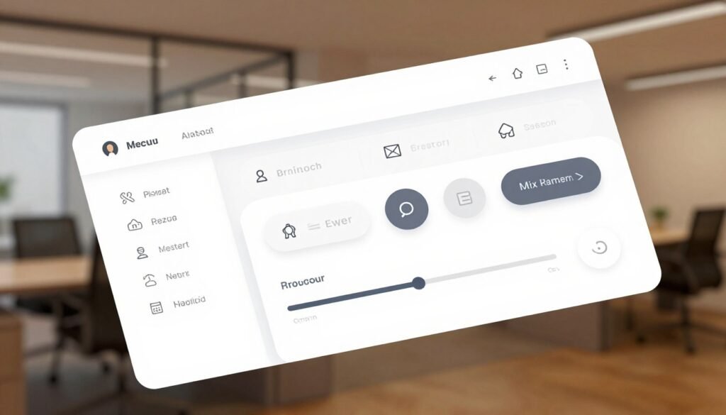
Best Practices for Creating Intuitive Menus
Creating intuitive menus means knowing navigation best practices. It’s all about making things easy for users. Using the same colors and fonts makes your site feel familiar. This makes it easier for people to find what they need.
Having enough white space in your menu makes it easier to read. It also helps avoid eye strain. Visual cues like icons help guide users, making their journey smoother.
By following these tips, your menus will be easy to use. This leads to a better experience for everyone.

Mobile Menu Design: Adapting to Small Screens
Mobile use is growing fast. Making a good mobile menu is key for a better user experience. Using responsive design makes menus work well on all devices. This keeps menus useful and easy to see.
Responsive Design Techniques
Responsive design helps menus look great on all screens. It uses flexible layouts and media queries. This makes menus fit well with the site’s design, giving users a great experience.
Hamburger Menus vs. Traditional Menus
Hamburger menus are popular for saving space on mobile screens. They offer a simple way to access important features. This makes navigation easy and fast.

| Menu Type | Advantages | Disadvantages |
|---|---|---|
| Hamburger Menu |
|
|
| Traditional Menu |
|
|
Navigation Design: Creating a Seamless User Experience
In today’s digital world, smooth navigation is key to a good user experience. A well-made navigation helps users find what they need fast. It makes moving around a website easy, making users happier.
Using clear structures is important for guiding users. These structures help users understand how things are connected. Tools like breadcrumbs help users keep track of where they are, giving them a sense of control.
Visual consistency is also vital for a good user experience. When design elements look the same, it makes the site look better and work better. This makes users more confident and eager to explore.

In short, making a website easy to use starts with good navigation design. By focusing on what users need and making navigation clear, we help them enjoy their online time.
Utilizing Consistent Layouts Across Platforms
In digital design, consistent layouts are key for good user interaction. People like familiar sites, so keeping the look the same on all devices is important. With more people using phones to browse, making sure a site looks good on both desktops and phones is vital.
This makes the site easier to use and helps keep the brand’s look strong. It also makes it easier for users to find what they need, no matter where they are.
Designing a site that looks the same on all devices helps with cross-platform navigation. It makes moving between screens easier. For example, using the same menus, colors, and buttons helps visitors get around quickly.
By keeping things simple, users enjoy their time on your site more. This makes their experience better and more enjoyable.

Information Architecture (IA) Fundamentals
Understanding information architecture is key for good content organization and user experience. It’s the foundation of how we arrange our content. This makes it easy for users to find their way around a website.
A solid information architecture makes a site easy to use. It helps users find what they need without getting lost. This makes the site more accessible and user-friendly.
Organizing Content for Accessibility
Putting content first makes it easier for users to find what they need. Tools like card sorting help teams see how users think about content. This leads to a structure that makes sense to users.
By organizing content well, we make it easier for users to navigate. This reduces frustration and makes the site more enjoyable to use.
Establishing Clear Hierarchies
Having a clear hierarchy is important in information architecture. It shows how different content pieces are related. This helps users understand where they are and where they can go next.
Visual tools like site maps help users see the structure of the content. This makes it easier for them to navigate. It reduces confusion and makes users feel more confident.

Testing and Iterating Navigation Designs
Creating good navigation is a never-ending job. It needs constant improvement through testing and making changes. By talking to users, we learn what they like and don’t like. This helps us make better choices for our designs.
Methods like A/B testing and usability testing are key. They let us see how people interact with our designs. This way, we know what works best for them.
User feedback is very important. It shows us what users like and what needs work. With tools like user paths and bounce rates, we get the data we need. This helps us make navigation that’s easy to use and meets user needs.
As we keep improving, we go through a cycle of testing and making changes. This focus on feedback makes sure our navigation stays useful and relevant.
Using Analytics to Inform Navigation Choices
Analytics are key in making navigation choices that match user behavior. By looking at site traffic and click-through rates, we learn how users use our menus. This helps us find and fix any problems that might make things hard for users.
Tools like Google Analytics and Hotjar show us how users move through our sites. This helps us make choices that improve how easy it is to get around. For example, knowing which pages are most visited helps us put those links first in the menu.
- Watch how users click on different parts of the menu.
- Find out where users stop following a path to see where they get lost.
- Try different designs with A/B testing to see what works best.
- Use data to make sure menus always meet user needs.
Using analytics helps us make better navigation choices. This makes our digital platforms more fun and easy to use for everyone.
Accessibility Considerations in Navigation Design
Making navigation for everyone is key to a great digital space. Accessibility design helps make sure all users, including those with disabilities, can use websites and apps easily. It focuses on making things work for everyone, not just some.
Designing for All Users
Adding features like keyboard navigation and screen reader support makes things better. These help people with different abilities use the web without trouble. Also, using clear colors and fonts helps those with vision problems see better.
Knowing about universal design helps us make navigation for all. We pay close attention to details to solve many accessibility problems. Here’s a table with important features for making navigation accessible:
| Feature | Description | Benefits |
|---|---|---|
| Keyboard Navigation | Allows users to navigate using keyboard shortcuts. | Enhances accessibility for individuals with mobility impairments. |
| Screen Reader Compatibility | Enables text-to-speech for visually impaired users. | Facilitates content comprehension and interaction. |
| High Contrast Colors | Utilizes color combinations that are easy to distinguish. | Improves visibility for users with visual challenges. |
| Responsive Design | Adapts navigation layouts across different devices. | Ensures accessibility on mobile and desktop interfaces. |
| Legible Fonts | Chooses clear, readable typefaces and sizes. | Improves reading ease for all users, including those with dyslexia. |
Trends in Modern Navigation Patterns
Keeping up with modern navigation trends changes how we connect with digital spaces. Today, navigation design is all about making things easier for users. For example, voice-activated navigation is becoming popular. It lets users browse without their hands.
Artificial intelligence is also changing navigation. It makes experiences personal by using what users like and do. Designers use data to make menus that fit each user’s needs better.
Designers are also moving towards simple designs. They use hidden menus that only show up when needed. This makes interfaces cleaner and easier to use.
By following these trends, we make digital spaces better for everyone. It helps users enjoy their time online more.
Case Studies: Successful Navigation Implementations
Looking at navigation case studies shows us the best ways to design. Companies like Amazon and Airbnb have great navigation strategies. These help users have a better experience.
Amazon is a great example. They use mega menus to let users quickly find products. This shows how good navigation design can make a big difference.
Airbnb also has a great navigation model. They offer advanced filtering options. This lets users find what they need easily, showing the value of meeting different user needs.
These examples show that good navigation is more than looks. It’s about making things easy for users. By learning from these examples, we can make better designs for everyone.
Future Directions in Navigation Design
The world of navigation design is about to change a lot. New technologies like augmented reality (AR) and immersive interfaces are coming. They will make navigation more fun and easy to use.
Gestures will soon control how we use digital stuff. Machine learning will make navigation fit each person’s style. This shows how we can meet future needs in navigation.
By using these new tools, we can make navigation both creative and useful. Knowing about these technologies helps us make better navigation designs. This will make user experiences even better.
Conclusion
Modern navigation design is always changing. It needs our full effort to understand what users want. In this summary, we’ve looked at important rules. These rules show how key simplicity, clarity, and easy access are.
Following these UX best practices helps us make menus and navigation systems better. They meet and even go beyond what users expect.
Keeping up with new trends and tools is key for making good navigation solutions. These designs are not just useful; they help keep users engaged and happy with our digital products. Let’s aim to make navigation experiences that really connect with users. This will put us at the leading edge of this field.