
We’re diving into the world of poster design, uncovering key rules. We’ll see how layout, contrast, and visual storytelling make posters stand out. These elements are vital for clear and effective message sharing.
Design experts like Canva and Adobe say mastering these rules boosts our work. It also sparks our creativity.
Understanding the Basics of Poster Design
Starting your poster design journey means learning the basics. Good poster design is more than looks; it’s a way to share messages. Images, text, and layout work together to get your message across.
Knowing the basics of poster design is key. You need to understand balance, contrast, hierarchy, and alignment. These tools help make designs that are not only pretty but also clear and effective. Experts say mastering these basics helps mix creativity with strong messages.

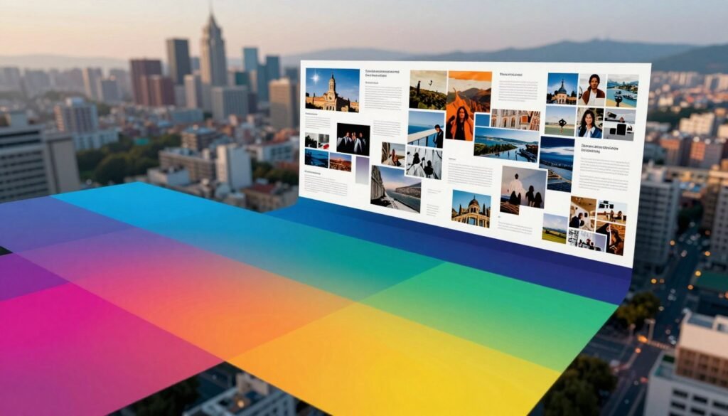
The Importance of Layout in Poster Design
In poster design, layout is key. It’s the base of the visual story. A good layout makes sure text and images work together well. It uses alignment, spacing, and grid systems for a unified look.
Defining the Layout Elements
Knowing the parts of layout is vital for good poster design. These parts work together to guide the viewer’s eye. The grid system and alignment make things look nice and organized.
Space between text and images is also important. It helps keep things clear and easy to understand. This way, viewers can take in the information without getting confused.
How Layout Influences Viewer Engagement
A good layout grabs the viewer’s attention. Posters that are well-organized and look good are more likely to catch someone’s eye. Studies show that clear designs help people remember things better.
This focus on layout helps connect the audience with the content. It makes them want to dive into the message. A well-thought-out layout makes the poster more effective. It shows the theme clearly and invites people to interact with it.

Effective Use of Contrast in Design
Contrast is key in design, making things stand out. It grabs attention and helps us see the message clearly. By using contrast right, we can make our designs pop and easy to understand.
What is Contrast and Why It Matters
In design, contrast means using different things like light and dark, big and small, or thick and thin. It’s important for catching the eye and showing off important parts. Good contrast makes sure our message gets across well.
Techniques for Creating Contrast
There are many ways to make a design stand out. Here are some top methods:
- Color Blocking: Using different colors can make important info jump out.
- Varying Font Weights: Mixing font sizes and styles makes reading easier and guides the viewer.
- Size Variation: Using different sizes for text and images helps show what’s most important.
- Shape and Texture: Mixing shapes and textures adds depth and makes the design more interesting.
| Technique | Effect on Design |
|---|---|
| Color Blocking | Catches the eye and emphasizes important sections. |
| Varying Font Weights | Enhances readability and directs focus to key points. |
| Size Variation | Creates a visual hierarchy, showing important info first. |
| Shape and Texture | Adds depth and intrigue to the design. |

Visual Hierarchy: Organizing Information
Visual hierarchy is key in poster design. It shows how elements are arranged to highlight what’s important. By changing size, color, and where things are placed, we lead our audience through our message.
A good visual hierarchy makes our posters clear and easy to understand. It helps focus the viewer’s attention on the most important parts. This way, they get the main idea better.
To make a poster stand out, create a clear path for the viewer’s eyes. This makes the poster look better and helps people understand it. A clear hierarchy leads viewers smoothly from one part to the next. This ensures they see the key points.

Using different design elements to show importance makes things clearer. For example:
| Element | Size | Color | Position |
|---|---|---|---|
| Main Title | Large | Bold Color | Top Center |
| Subheading | Medium | Contrasting Color | Below Title |
| Body Text | Small | Neutral Color | Left-Aligned |
| Images/Graphics | Variable | Eye-Catching | Mixed Positions |
This method makes sure headlines, subheadings, and images work together well. A well-designed poster is not just eye-catching. It also shares information clearly with the audience.
Choosing the Right Color Scheme for Your Poster
Color is key in poster design. It affects how we feel and what we see. Warm colors like reds and yellows make us feel energetic. Cool colors like blues and greens calm us down.
Choosing the right colors helps our design look good and feel right. It makes our poster easy to read and fun to look at.
Psychology of Color in Design
Colors can make us feel certain ways. Here’s how:
- Red: Passion, urgency, excitement.
- Blue: Trust, serenity, professionalism.
- Green: Growth, health, tranquility.
- Yellow: Optimism, cheerfulness, attention.
By picking colors wisely, we can make our poster match its message. It will also connect with our audience.
Complementary vs. Contrasting Colors
Choosing between complementary and contrasting colors changes how our design looks. Complementary colors are next to each other on the color wheel. They make our poster look balanced.
Contrasting colors, on the other hand, are bold and grab our attention. They highlight important parts of our poster. Both ways can make our color scheme pop and get our message across.
| Color Type | Description | Examples |
|---|---|---|
| Complementary | Colors that enhance each other when paired, creating balance. | Blue and Orange, Red and Green |
| Contrasting | Colors that stand out against each other, creating visual excitement. | Yellow and Purple, Black and White |

Grid Systems: The Backbone of Poster Design
Grid systems are key in poster design. They help create a well-organized layout. Designers use them to line up elements, making the design look good and easy to understand.
Grid systems keep information together. This is important for grabbing and keeping the viewer’s attention.
Understanding Grid Layouts
A grid layout breaks the poster into rows and columns. It’s like a map for where to put pictures and text. This method can be simple or complex, depending on the design.
It lets designers be creative while keeping things clear. Grid layouts also help guide the viewer’s eye through the design.
Benefits of Using a Grid System
Using a grid system in poster design has many benefits:
- It makes everything look consistent and connected.
- It helps avoid mess by focusing on the most important parts.
- It makes it easy to change things without messing up the design.
- It helps information flow smoothly.
Grid systems help make our poster designs better. They lead to more effective visual stories.

Typography: Selecting Fonts for Impact
Typography is key to getting our message across. When picking fonts, we see how they change how our designs are seen. The right fonts make reading easier and show off the content’s personality, making our designs stand out.
Types of Fonts and Their Effects
Fonts fall into three main groups:
- Serif fonts: These have small lines or strokes at the end of letters. They feel traditional and reliable. They’re great for print and formal stuff.
- Sans-serif fonts: Without those lines, they look clean and modern. Perfect for digital stuff, making it easy to read on screens.
- Display fonts: These are bold and grab attention. They add flair but should be used carefully.
Font Pairing Best Practices
Pairing fonts right is key for a good design. Here’s how to do it:
- Contrast: Pick fonts that look good together. Mixing serif and sans-serif fonts can be interesting and easy to read.
- Limit Choices: Use only two or three fonts. Too many can mess up the message.
- Functionality: Make sure fonts match the design’s purpose. They should fit the theme and mood of the content.
Visual Storytelling: Crafting Your Message
Visual storytelling changes how we make posters. It turns simple pictures into powerful stories. We mix visuals, graphics, and text to tell a story that grabs attention.
A good story in pictures does more than share facts. It connects with people on an emotional level. By choosing the right images, we make our message stick in people’s minds.

- Clears up complex ideas in a simple way.
- Creates a strong connection with the audience through feelings.
- Gets the main message across without too much text.
- Gives the poster a unique look that stands out.
As we get better at visual storytelling, we improve our ability to share messages. This makes us better at creating posters that teach and inform.
Utilizing Images and Graphics Effectively
Images and graphics are key to making our designs better. The right visuals can make a big difference. They should match our message and theme, so viewers can connect with it.
Choosing the Right Imagery
Choosing images is all about relevance and quality. Pictures that speak to our audience can boost engagement. Sites like Shutterstock have lots of options, but custom graphics can make our work stand out.
Balancing Text and Visuals
Finding the right mix of images and text is important. It helps keep important info clear without being too much. Text should work with images to share the poster’s message well.

| Aspect | Images | Text |
|---|---|---|
| Purpose | Attract attention, convey emotion | Inform, guide understanding |
| Quality Requirement | High-resolution | Well-structured |
| Design Role | Enhances aesthetic appeal | Clarifies core message |
| Integration | Supports and illustrates | Captures and communicates |
The Role of White Space in Design
White space is often overlooked in poster design, but it’s very important. It helps make the design clear and easy to understand. By using white space well, we can make sure people see what’s important.
Empty areas help balance the design. They make the visual experience smoother. This makes the design more enjoyable to look at.
Defining White Space and Its Importance
White space is the empty areas around design elements. It’s key to making a design look good and easy to get. Using white space well can make a design much better.
Designers say it helps avoid clutter. It lets viewers focus better on the content. This makes it easier for them to understand and remember what they see.
Creating Movement and Flow in Your Design
Movement in a poster design grabs attention and guides the viewer. Designers use elements and visual cues to make sure the design flows well. This makes it easy for viewers to follow the design.
Leading the Eye through Design
Creating movement in design needs careful planning. To lead the viewer’s eye, designers use:
- Lines and arrows to show direction.
- Repeating shapes or colors to highlight.
- Placing images and text to guide the eye.
Every element in design is important. Placing visuals and text wisely makes a journey through the design. This journey makes the design more appealing and clear.
| Technique | Effect | Purpose |
|---|---|---|
| Arrows | Directs attention | Guides viewer navigation |
| Curved Lines | Creates softness | Encourages a relaxed viewing experience |
| Contrast | Enhances focus | Highlights key information |
| Composition & Layout | Affects perception | Balances elements for flow |
Making posters move improves how people engage with them. It makes the experience more fun and effective. This shows how important design flow is for clear communication.
Consistency in Design Elements
Design consistency is key to a strong visual identity. It helps create cohesive designs that clearly share our brand message. When colors, fonts, and images look the same, it makes our brand more familiar to people.
Cohesive designs show we are professional and pay attention to details. These traits are important for keeping people interested. Using the same design elements can turn a simple poster into something eye-catching.
Incorporating Feedback and Iteration
In poster design, getting feedback is key. It helps us make our designs better. By getting input from others, we can spot areas we might have missed.
Value of Peer Reviews in Poster Design
Peer reviews are vital for our projects. Sharing our designs with others gives us new ideas. This feedback helps us improve our work.
- Broader Perspectives: Working with others brings new insights to our designs.
- Constructive Criticism: Honest feedback shows us what’s good and what needs work.
- Enhanced Creativity: Talking through ideas can lead to new, exciting solutions.
By using feedback and peer reviews, we keep improving. This cycle of making things better leads to strong poster designs. These designs then share our message clearly.
| Peer Review Method | Benefits | Considerations |
|---|---|---|
| In-Person Feedback Sessions | Immediate responses and interaction | Possible groupthink |
| Online Review Platforms | Asynchronous feedback and wider reach | Less personal interaction |
| Focus Groups | Target audience insights; valuable user feedback | Requires careful selection of participants |
Testing Your Poster with Target Audiences
Testing our poster designs with target audiences is key to improvement. It lets us get feedback from users, which helps us improve our designs. Seeing how real people react to our designs shows us what works and what doesn’t.
Methods to Gather User Feedback
There are many ways to get feedback:
- Surveys: Questionnaires after a presentation help us check design details.
- Focus Groups: A diverse group can share their thoughts on design reactions and likes.
- A/B Testing: Showing different poster versions helps us see what people like best.
Using these methods, we can do deep design checks. This helps us make our posters better.
| Method | Purpose | Benefits |
|---|---|---|
| Surveys | Collect quantitative data on user preferences. | Efficient for large sampling, high-level insights. |
| Focus Groups | Gather qualitative feedback through discussion. | In-depth understanding of user perceptions and emotions. |
| A/B Testing | Evaluate two design variations simultaneously. | Data-driven decision making, identifying effective elements. |
Final Touches: Proofreading and Polishing Your Design
As we finish the poster design, the last steps are key to making it great. Proofreading checks if the words are right and connect with the audience. It also makes sure every detail is perfect, avoiding mistakes that can hurt your design.
Common Mistakes to Avoid
When aiming for the best, knowing common mistakes is important. Focus on:
- Typographical errors that mess up the message.
- Alignment mistakes that make the design look bad.
- Color errors that mess up the poster’s look.
Proofreading is very important. Reading your work many times helps find errors. Getting feedback from someone else can also catch things you missed.
Conclusion
Mastering poster design is about mixing layout, contrast, and storytelling. Each part is key to connecting with people. We’ve learned how our designs can really make a difference.
Using what we’ve learned, we can make posters that look great and get our message across. This journey is all about trying new things and getting better. With the right skills, we can really grab our audience’s attention.
As we finish this guide on poster design, let’s keep these ideas alive. Every poster is a chance to share our creativity and make a mark. Our love for design will lead to new and exciting things, making our work even better.