
We begin with a clear promise: this guide will map the practical gap between print design and digital design. We explain technical rules, production steps, and strategic trade-offs so engineers, students, educators, and design professionals can apply them to brand campaigns, product documentation, UI/UX work, and marketing collateral.
Across the article we move from fundamentals—color spaces, typography, and file formats—to applied workflows like asset preparation, cost estimation, and collaboration. That structure helps teams and classrooms decide when to use specific design formats and how to keep branding assets consistent across touchpoints.
We present real-world use cases and hands-on checks: preparing print-ready PDFs for an offset run, optimizing images for responsive web, and setting up an asset library for cross-channel campaigns. Our tone is technical but approachable—we translate jargon into concrete steps and examples from familiar tools like Adobe InDesign, Figma, and Git-based versioning.
Key Takeaways
- Print vs Digital Design requires different color workflows: CMYK for print and RGB for screens.
- Choose design formats that match the final medium to avoid rework and preserve branding assets.
- Typography and layout rules change by medium—optical scaling for print, responsive type for digital.
- Prepare separate export and proofing steps: print proofs and soft proofs ensure accuracy.
- Plan collaboration early: printers, developers, and designers need shared specs and version control.
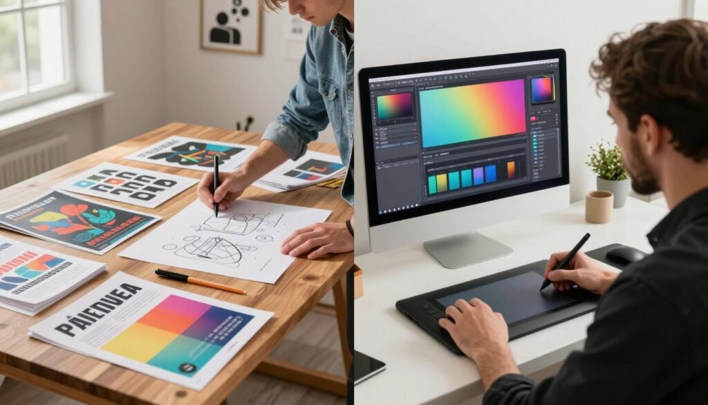
Print vs Digital Design
We work at the intersection of craft and systems: comparing print design and digital design reveals distinct constraints that shape every choice. Color rendering, resolution, and interaction change how an idea becomes a real touchpoint. Getting the medium wrong wastes budget and weakens brand perception.

Why this comparison matters for modern designers
We must accept that print and screens follow different rules. Print design requires attention to CMYK, dots per inch, and substrate. Digital design centers on RGB, responsive layouts, and performance. Each discipline demands quality assurance steps that engineers and educators can translate across projects.
Choosing an inappropriate workflow leads to poor fidelity: colors that shift, images that blur, or interactions that fail. That outcome harms campaign results and reduces trust in branding assets.
How choosing the right medium affects branding assets and campaign results
We plan campaigns by mapping audience touchpoints. Print delivers tactile value — packaging, signage, and high-end collateral influence perceived quality. Digital amplifies reach and supplies analytics that drive iteration. Smart teams weave both into hybrid campaigns to balance presence and performance.
Decisions about medium affect measurable outcomes: conversion rates, production timelines, and costs. Premium paper and finishes can raise perceived value at retail, while faster digital iterations improve A/B testing and optimization. Our practical checklist starts with audience, fidelity, budget, and timeline to guide whether print, digital, or a mixed approach best serves objectives.
Fundamental Principles of Print Design
We approach print design as a craft that balances color science, mechanical tolerances, and material choice. Practical understanding of color conversion, page setup, and substrate behavior keeps branding assets consistent across campaigns and avoids costly reprints.

Color modes and why CMYK matters for physical output
Print presses use pigment and ink, so we plan art in CMYK rather than RGB. CMYK (cyan, magenta, yellow, black) limits gamut compared to screens, so bright blues and neons often shift when converted.
When a specific hue matters, we recommend spot colors such as Pantone or expanded gamut processes like hexachrome. We soft-proof in Adobe Photoshop or Illustrator with the vendor’s ICC profile to predict shifts and set expectations for clients.
Bleed, trim, and safe zones explained
Bleed extends artwork beyond the cut edge; typical values are 1/8″ (3mm). Trim marks show the final edge of the piece. Safe zones keep logos and text inside the trim by about 1/8″–1/4″ to prevent accidental cropping.
We always include crop marks and a clear bleed in exported PDFs. Trapping and registration marks reduce visible gaps from press movement, so we build slight overlaps for solids and adjacent colors.
Paper stocks, finishes, and tactile considerations
Choosing paper stocks affects color, ink absorption, and tactile impression. Coated papers give punchy colors and crisp detail, while uncoated stocks offer a softer, organic feel. Text weights suit flyers and letterheads; cover weights work for cards and covers.
Finishes like matte, gloss, silk, aqueous coating, and UV spot varnish change both look and hand-feel. A gloss coating boosts saturation; matte reduces glare and can mute brand colors. We test press proofs so branding assets render as intended on the selected stock.
Practical production tips: provide 300 dpi images, include bleed and crop marks, request press proofs or press sheets, and share Pantone references when exact color matching is required. These steps protect print investments and align expectations between design and production.
Core Principles of Digital Design
We approach digital design as a craft that bridges engineering and human behavior. Screens bring color, motion, and interaction together. Our goal is to make experiences that feel clear, fast, and predictable across devices.

RGB color space and screen consistency
Screens render color with light: red, green, blue. That makes color device-dependent. Monitors, laptops, tablets, and smartphones each display tones differently. We test assets on representative hardware and calibrate where possible to reduce surprises.
sRGB remains the de facto standard for web delivery. Encoding images and graphics in sRGB gives predictable results across most browsers and operating systems. For wide-gamut displays, we embed profiles when necessary, but we prioritize sRGB to keep brand colors stable in everyday use.
Responsive layouts and device considerations
Responsive design rests on fluid grids, clear breakpoints, and a mobile-first mindset. We design layouts that adapt: columns collapse, navigation simplifies, and content hierarchy shifts to serve the smallest viewport first.
Pixel density matters: a 2x (Retina) display needs higher-resolution assets to stay crisp. Touch targets must meet minimum sizes for usability. We balance image resolution against performance to avoid slow page loads.
Interactivity, animation, and user experience
Interactivity gives digital interfaces states: hover, focus, pressed, and loading. Micro-interactions communicate feedback and guide users. Motion should follow simple rules: brief timing, natural easing, and limited scope so it supports, not distracts.
Animations must respect accessibility: provide reduced-motion options and ensure transitions do not impede readability or navigation. Thoughtful interactivity strengthens usability and helps meet accessibility guidelines.
Tooling, prototypes, and design formats
We use Figma, Adobe XD, and Sketch for responsive prototypes and developer handoff. Design systems and reusable components speed iteration and enforce consistency. Export presets for PNG, JPEG, SVG, and WebP help match asset needs to performance targets.
| Principle | Practical Focus | Impact on Workflow |
|---|---|---|
| Color | Use sRGB, test on representative hardware, embed profiles when needed | Reduces color drift between design and production |
| Layout | Fluid grids, mobile-first breakpoints, prioritized content hierarchy | Improves usability across viewports and speeds decisions |
| Assets | Scale for pixel density, choose WebP/SVG for web, optimize file size | Balances crisp visuals with faster load times |
| Motion | Short durations, easing curves, reduced-motion support | Enhances clarity without harming accessibility |
| Interactivity | Clear affordances, state design, micro-interactions | Guides user behavior and reduces friction |
| Tools | Figma, Adobe XD, Sketch; shared libraries and tokens | Streamlines handoff and maintains consistent design formats |
Design Formats and File Types for Print
We outline the file choices and workflows that keep print projects predictable and crisp. Good print design begins with the right design formats and clear communication with the print vendor. Small, deliberate steps reduce rework and avoid costly delays.

Common print file formats: PDF/X, EPS, TIFF
PDF/X is the industry standard for print-ready files. Versions like PDF/X-1a and PDF/X-4 help ensure fonts and images are embedded and that transparencies are handled. Printers using Kodak or Heidelberg RIPs expect these formats for reliable output.
EPS remains useful for legacy vector assets from Adobe Illustrator or CorelDRAW. Use EPS when a vendor requires encapsulated vector art, but avoid it for complex layered work.
TIFF is the go-to for high-quality raster images. Save critical art at 300 dpi, with LZW or no compression. Avoid JPEG compression for final print masters: it introduces artifacts that show up on press.
Embedding fonts and handling linked assets
Embedding fonts prevents substitution across platforms. When we embed fonts in PDF/X, we preserve type fidelity. Outlining text guarantees look but removes editability: choose based on the project stage.
Packaging workflows in Adobe InDesign collect linked images, fonts, and instructions into a single folder. We recommend using InDesign Package for print jobs sent to vendors like Vistaprint or local commercial printers. Confirm that all linked assets are present and that images meet resolution targets.
Preparing files for print vendors and proofs
Run preflight checks in Adobe Acrobat or the printer’s RIP tool. Check for missing fonts, low-res images, wrong color spaces, and transparency problems. Include bleed, crop marks, and a contact sheet or mockup in the package.
Keep color management tight: convert RGB images to CMYK only when you soft-proof using the vendor’s ICC profile. This step reduces surprises on press. For spot colors, label Pantone references clearly and agree on ink limits and coatings with the press operator.
Request either a hard press proof or a certified digital contract proof before full runs. Confirm press conditions: paper stock, ink density, and finishing options. Agree on turnaround times and shipping logistics at the outset to avoid last-minute changes.
| Format | Best Use | Key Specs | Pros / Cons |
|---|---|---|---|
| PDF/X-1a | Final press-ready layouts | Embedded fonts/images; flattened transparencies | Reliable on press; limited transparency support |
| PDF/X-4 | Modern workflows with live transparency | Embedded assets; supports layers and transparency | Flexible; requires compatible RIP |
| EPS | Legacy vector exchange | Single-page vector; may lack embedded fonts | Good for simple vectors; not ideal for complex files |
| TIFF | High-quality raster images | 300 dpi recommended; LZW or no compression | Excellent image quality; large file sizes |
| InDesign Package | Project handoff to printers | Collects fonts, links, and instructions | Complete workflow bundle; requires source files |
Design Formats and File Types for Digital
We design for screens with a toolbox built on clear choices: image formats, export settings, and delivery pipelines. Picking the right design formats affects load times, visual fidelity, and developer handoff. Below we break practical options into actionable advice for teams working in digital design.

Web and app-ready formats:
Use JPEG for photographic content where lossy compression keeps file size small. Choose PNG when you need transparency or sharp edges for icons and UI elements. Export SVG for logos and vector icons so graphics scale cleanly across resolutions. Adopt WebP where browser support permits for better quality-to-size ratios; supply fallbacks for legacy browsers.
Optimizing images and assets for performance:
Serve responsive images with srcset and the picture element to match device widths. Export at 1x, 2x, and 3x for standard, Retina, and high-density displays. Run compressed assets through tools like ImageOptim, Squoosh, or TinyPNG to strip metadata and reduce bytes without visible loss.
Asset pipelines and SVG handling:
Export optimized SVGs for icons and illustrations. Minify SVG code, remove comments and hidden metadata, and simplify paths when possible. Inline small SVGs or use CSS sprites to cut HTTP requests and improve render speed where appropriate.
Performance trade-offs:
Oversized images slow pages and lower SEO rankings. Implement lazy loading for below-the-fold media, configure long-lived caching headers, and deliver static assets through a CDN to reduce latency and bandwidth costs.
Version control and export settings for multiple screens:
- Name files clearly: asset@1x.png, asset@2x.png, icon.svg. This reduces ambiguity during handoff.
- Use design tokens for color, spacing, and type to keep exports consistent across platforms.
- Coordinate with developers via Figma Inspect, Zeplin, or Storybook to share specs and downloadable assets.
Compression and browser support table:
| Format | Best use | Strengths | Considerations |
|---|---|---|---|
| JPEG | Photos | Small file size for complex imagery | Lossy artifacts at high compression |
| PNG | Transparency, UI assets | Lossless, crisp edges | Larger files for photos |
| SVG | Logos, icons, vectors | Scalable, editable, tiny for simple shapes | Complex SVGs can bloat without optimization |
| WebP | Modern web images | Superior quality-to-size ratio | Fallbacks needed for older browsers |
We recommend documenting export presets, automating compression in CI, and keeping a clear naming convention in version control. This creates repeatable workflows that preserve quality while minimizing page weight, aligning design intent with engineering needs across screens.
Typography: Print vs Digital Considerations
We compare how type behaves in print and on screens so designers can make informed choices for branding assets and legibility. Small shifts in size, spacing, or font delivery change how a message reads across print design and digital design.

Readability, type sizes, and optical scaling in print
Print demands attention to optical scaling: designers use display and text cuts so glyphs look right at intended sizes. Choose typefaces with a healthy x-height and moderate stroke contrast for newspapers, books, and brochures. For body copy we recommend 9–12 pt depending on readership and paper choice.
Kerning and tracking need fine tuning for high-resolution output. Tools in Adobe InDesign offer optical kerning and glyph controls that help maintain consistent color and rhythm across a page. Test proofs under expected lighting and on final paper stock to confirm legibility.
Web fonts, system fonts, and variable fonts for screens
On screens pick from Google Fonts, Adobe Fonts, or self-hosted families while weighing performance and license terms. Use font-display strategies to reduce FOIT and FOUT so content appears quickly and predictably.
Variable fonts provide weight and width axes in a single file. That reduces HTTP requests and gives fine typographic control for responsive layouts. System fonts remain useful for performance-critical interfaces and fallbacks in complex digital design.
Line length, spacing, and accessibility differences
For comfortable reading keep line lengths between 45 and 75 characters and line-height near 1.4–1.6 for body text. These ranges work for both print and screens when adjusted for medium-specific factors like paper contrast or pixel density.
Contrast matters for accessibility: follow WCAG ratios for text and graphics so content stays readable in low light or high glare. Screen legibility benefits from larger x-heights and slightly wider tracking, while print can tolerate tighter letter spacing because of higher resolution.
Pair typefaces thoughtfully and test across real devices and printed proofs. Maintain consistent branding assets by defining font stacks, styles, and acceptable optical-scaling rules in your design system.
| Aspect | Print Design | Digital Design |
|---|---|---|
| Recommended body size | 9–12 pt depending on typeface and paper | 16–18 px baseline for web, adjust with responsive scaling |
| Optical scaling | Separate text/display cuts; manual kerning via InDesign | Variable fonts and tuned hinting for pixel grids |
| Font delivery | Embedded fonts in print-ready PDFs; outline when required | Web fonts, system fonts, self-hosting; font-display strategies |
| Spacing | Tighter tracking possible due to high DPI | Slightly looser tracking and increased line-height for screens |
| Accessibility | Consider lighting and paper contrast; larger sizes for poor lighting | WCAG contrast ratios, responsive type, and readable on varied devices |
| Impact on branding assets | Consistent print typography strengthens physical brand touchpoints | Flexible web fonts and variable fonts enable cohesive digital identity |
Color Management Across Mediums
We guide teams through practical color management to keep brand color consistent from screen to press. Small steps—like routine monitor checks and clear color specs—cut surprises and save time. This section explains tools and workflows that bridge RGB workflows and CMYK results for both print design and digital design projects.

Calibrating monitors and proofing for print accuracy
We recommend hardware calibrators such as X-Rite i1Display and Datacolor Spyder to set brightness, contrast, and color temperature. Calibrating monitors ensures designers see consistent color across workstations and reduces mismatches when converting RGB files for print design.
Routine calibration is a simple quality gate: schedule checks weekly or before major proofs. For teams, keep a master profile and document target luminance and gamma so everyone works from the same baseline.
Using color profiles and soft proofing workflows
ICC profiles from Epson, HP, or commercial printers describe how a device reproduces color. Embed these profiles in exported files to keep intent clear for vendors and for digital archives.
Use soft proofing in Adobe Photoshop and Illustrator to preview how RGB artwork will render in CMYK. Toggle proof setups, compare intent versus perception, and adjust before sending files to press. Embed the final profile in PDFs for print-ready delivery.
Brand color consistency between print and digital assets
Centralize color specs in a brand guide: include HEX, sRGB, CMYK, and Pantone values for each key color. Use design tokens in development to sync digital design components with print-ready references.
When a brand color must match exactly—packaging or identity materials—specify spot colors or Pantone inks in print jobs. For mixed workflows, supply both Pantone equivalents and CMYK builds so printers choose the correct route.
When colors shift on press, troubleshoot methodically: check paper absorbency and whiteness, confirm press calibration and ink densities, and request contract proofs or press checks for critical runs. Keep samples and notes from each job to build a vendor-specific color history.
We maintain consistency by combining calibrated displays, embedded ICC profiles, and a clear brand palette. These practices reduce rework, protect branding assets, and align expectations across print design and digital design teams.
Layout and Composition Strategies
We map how layout strategies shape perception and function across print design and digital design. Clear rules speed decision-making: choose a grid, set scale, then refine spacing to support reading and interaction. This section breaks the work into practical steps we can apply to branding assets and real projects.

Grid systems for print vs flexible grid for responsive design
Print often relies on rigid column grids with fixed dimensions. Magazines and brochures use these to lock type, images, and margins into a predictable rhythm. Baseline grids give vertical rhythm and make multi-page work feel coherent.
Digital work favors a responsive grid built with CSS grid and flexbox. A responsive grid reflows content across breakpoints. We plan for fluid gutters and modular units so elements adapt without losing hierarchy.
Hierarchy, negative space, and focal points by medium
Hierarchy starts with scale: headlines, subheads, body copy. In print design we create immediate anchors — large type or images that orient the reader at first glance. Tactile sequencing guides the eye through page folds and spreads.
Digital design uses progressive disclosure: interactive controls reveal detail only when needed. Spacing supports touch targets and scan paths. Thoughtful negative space improves scannability and reduces cognitive load.
Adapting layouts from print to digital and vice versa
To convert print to web, we reflow content: prioritize mobile-first, collapse columns, and simplify compositional flourishes. Reduce columns into stacked modules and convert spreads into scrollable sections. Replace tactile cues with visual affordances for interaction.
To bring digital work into print, we ensure resolution, increase bleed, and turn interactive features into static equivalents: hover states become captions, carousels become sequences. Check color in CMYK and proof images at 300 DPI for reliable output.
Practical patterns speed this cross-medium work. Use modular cards, responsive images, and typographic scales that map between points and pixels. Keep a small set of templates so branding assets stay consistent whether in a brochure or on a landing page.
- Cards: modular, stackable, easy to reflow between columns and breakpoints.
- Typographic scales: map step sizes for print points to CSS rems for screens.
- Image rules: define crop, focal point, and minimum resolution for both media.
Imagery and Asset Preparation
We handle imagery with systems that match output and intent. Good asset preparation starts with clear file organization, master files, and consistent naming. That practice saves time when you switch between print and screen design formats.
Image resolution must match the final medium. For print, set DPI to 300 for photographic detail. For screens, work toward 72–150 PPI for typical displays and export @2x assets for high-density devices. Always check effective resolution after scaling.
Our retouching pipelines begin with RAW masters when possible. Use non-destructive edits in Adobe Lightroom or Camera Raw to preserve latitude. Apply color correction in a wide-gamut workspace, then convert to the target design formats before output.
Sharpening differs by channel: lighter, targeted sharpening for print to suit halftone dots and viewing distance; slightly stronger, screen-optimized sharpening for digital previews. Add output sharpening only after you know final size and DPI or PPI.
Choose vectors for logos, icons, and any element that must scale without loss: SVG, AI, or EPS are preferred. Use raster files for rich photography and textured imagery. When effects force rasterization, rasterize at a safe image resolution so you retain quality for both print and web.
We keep master files—RAW, layered PSD, and original AI vectors—alongside optimized exports: TIFF or PDF for print, PNG/JPEG/WebP for web, and SVG for scalable UI elements. This preserves flexibility across raster and vector workflows.
Asset naming and folder structure matter: include purpose, dimensions, color space, and version in filenames. That helps teams hand off assets to printers, developers, and marketers without rework. Clean organization reduces errors when converting between DPI and PPI targets.
When preparing exports, verify color-managed profiles, inspect flattened proofs for design formats, and test on intended devices or printed proofs. These checks ensure retouching, color correction, and image resolution hold up in final use.
Accessibility and Usability in Digital Design
We prioritize accessibility as a core part of digital design. Good usability makes products useful for more people and strengthens branding assets across touchpoints. Small choices—like readable type, clear focus states, and sensible content order—shape how users interact and how search engines index pages.
Contrast, legibility, and keyboard navigation
Legibility starts with contrast. Follow WCAG ratios: 4.5:1 for normal text and 3:1 for large text. Use tools such as WebAIM Contrast Checker to validate color choices early in the design cycle.
Make type scalable: set sizes with relative units and test at multiple zoom levels. Visible focus indicators help keyboard users know where they are. Ensure interactive controls receive logical tab order and can be activated with Enter and Space.
Use ARIA attributes only when native HTML cannot convey roles or states. Test with NVDA on Windows and VoiceOver on macOS to confirm screen reader behavior matches intent.
Inclusive imagery and responsive content considerations
Choose images that reflect diverse users and accessible contexts. Provide concise alt text that describes function and content. Add captions when context improves comprehension.
Design for stacked layouts: verify content reads logically when columns collapse. Avoid hover-only interactions; provide clear touch targets for mobile. Respect prefers-reduced-motion and offer alternatives to animation for users sensitive to motion.
SEO implications for visual content and performance
Optimize filenames and use descriptive alt attributes to improve discoverability. Compress images to balance quality and load time. Structured data can help search engines understand visual content and improve indexing.
Faster pages boost both usability and SEO. Keep branding assets lean: export multiple sizes, choose efficient formats, and employ responsive images so devices request the right file for each viewport.
| Area | Best Practice | Tools / Notes |
|---|---|---|
| Contrast & Legibility | WCAG ratios (4.5:1 normal, 3:1 large); scalable type; visible focus | WebAIM Contrast Checker; browser zoom testing; system font fallbacks |
| Keyboard & ARIA | Logical tab order; native semantics first; ARIA for complex widgets | NVDA, VoiceOver, Lighthouse accessibility audits |
| Imagery | Diverse subjects; descriptive alt text; meaningful captions | Image file naming; metadata; content review for representation |
| Responsive Content | Logical stacking; avoid hover-only; prefers-reduced-motion support | Responsive test devices; CSS media queries; user preference checks |
| SEO & Performance | Compressed assets; descriptive alt; structured data where useful | Image compression tools; lazy loading; Google PageSpeed and Lighthouse |
Production and Cost Considerations
We outline practical cost drivers and timeline cues so teams can plan budgets and set expectations. This short guide compares print and digital levers: what raises production costs, which design formats save time, and how runs or hosting choices affect total spend. Use these points to decide when to invest in premium tactile work and when to favor rapid digital reach.
Print planning: setup, runs, finishes, and logistics
Print production starts with setup fees: plate making, press calibration, and proofs add fixed costs. That makes small runs proportionally expensive per unit. Larger runs lower per-unit cost because setup spreads across more pieces.
Special finishes—foil stamping, embossing, spot UV—raise variable costs but deliver higher perceived value. Paper choice, die cuts, and inks affect pricing. Logistics add another layer: warehousing, shipping, and handling returns must be budgeted. These line items shape the real cost of a printed campaign.
Digital production: development, hosting, and ongoing spend
Digital production costs vary with complexity: custom front-end work, backend integrations, and APIs require development time. Animations and video assets increase build and performance work, which can push up both initial and recurring costs.
Hosting and CDN fees are recurring and scale with traffic. Maintenance—security patches, content updates, and monitoring—creates steady operational costs. Choosing managed cloud providers and component libraries can reduce long-term burden.
Timelines and format choices for cost efficiency
Typical lead times differ by medium. Print proofs and press runs can take days to weeks based on complexity and finishes. Digital projects follow iterative sprints, QA cycles, and deployment windows that can shorten with modular design formats.
Format trade-offs matter: choose limited runs with premium finishes for high-touch brand moments, and favor digital for rapid testing and wide distribution. Standard sizes and fewer colors reduce print spend. For screens, using templates, design systems, and optimized assets lowers development and hosting strain.
| Project Size | Print Typical Timeline | Digital Typical Timeline | Cost Focus |
|---|---|---|---|
| Small (promo mailer, landing page) | 3–7 days for proofs; 1–2 weeks for short runs | 1–3 weeks for template-based site or simple microsite | Use digital printing for short runs; reuse branding assets and templates |
| Medium (catalog, marketing site) | 2–4 weeks with finishes and bindery | 4–8 weeks for custom features and integrations | Standard sizes, limit spot colors; component libraries reduce dev time |
| Large (packaging, enterprise platform) | 4–12 weeks: tooling, long runs, complex logistics | 3–6 months with backend integration and QA | Negotiate bulk pricing for runs; use cloud scaling and modular architecture to control hosting costs |
Cost-saving tactics work across mediums. For print: choose stock sizes, combine SKUs, and prefer digital printing for small volumes. For digital: leverage React or Vue component libraries, pick regional CDNs, and automate deployments to cut maintenance hours.
We recommend auditing production costs early, mapping design formats to campaign goals, and cataloging branding assets for reuse. That approach reduces waste, keeps lead times predictable, and aligns spend with impact.
Branding Assets Across Print and Digital
We build a cohesive brand system that works across print design and digital design by defining clear rules for logos, color, type, imagery, and voice. These rules include CMYK, RGB, Pantone, and HEX values; logo variations for different sizes; and tone guidelines to keep messaging consistent.
We store core files in centralized asset libraries so teams can find approved materials quickly. For larger organizations we recommend platforms like Bynder, Frontify, or Adobe Experience Manager. Smaller teams may use Google Drive with strict folder structures and access controls.
We use design tokens and CSS variables to sync visual language between code and creative. That keeps color, spacing, and type scales aligned across web, mobile, and print. Asset libraries should include master files, production exports, and a changelog for versioning.
We enforce practical file naming to reduce errors in handoffs. A good convention includes purpose, color space, size, and version—for example: logo_primary_RGB_v2.svg or brochure_8.5x11_CMYK_v1.pdf. Embed metadata for copyright and ownership in master files.
We automate distribution to speed delivery and limit mistakes. For digital design, use CDNs and automated export pipelines that produce web-optimized PNG, JPEG, and SVG files. For print design, bundle a vendor package with specs: bleed, trim, safe zones, color profiles, and approved proofs.
We set governance through review boards and approval workflows to protect the brand. Periodic audits should check color accuracy, typography rules, file formats, accessibility, and the integrity of branding assets across touchpoints.
Use the checklist below when introducing new materials to the system.
| Checklist Item | Why It Matters | How to Verify |
|---|---|---|
| Color specs (CMYK/RGB/Pantone/HEX) | Ensures consistency between print and screens | Compare soft proofs and color swatches; validate design tokens |
| Typography rules | Maintains legibility and brand tone | Check font files, web font loading, and optical sizes |
| File naming and metadata | Reduces version confusion in production | Confirm naming convention and embedded ownership data |
| Master files vs exports | Protects originals for future edits | Verify master folder contains layered source files and locked exports |
| Asset libraries access | Controls who can edit and publish | Audit permissions and review recent changes |
| Print vendor package | Prevents costly print errors | Include PDFs with bleed, proofs, and press-ready specs |
| Digital distribution | Delivers fast, consistent assets to users | Test CDN delivery, file sizes, and responsive behavior |
| Accessibility and compliance | Keeps brand inclusive and legally sound | Run contrast checks and accessibility audits |
Workflow and Collaboration Best Practices
We build processes that keep design moving and reduce friction between teams. A clear workflow sets roles, timelines, and handoff expectations for both print design and digital design projects. Small, repeatable steps make reviews faster and lower the chance of costly rework.
We rely on version control to track changes and restore earlier states when needed. For code, Git with Git LFS handles large binaries. For visual files, Figma gives real-time collaboration, Abstract provides versioning for Sketch, and Adobe Creative Cloud syncs masters. Consistent file naming and short changelogs keep teams aligned.
Handoff tools bridge design and development. We export tokens, specs, and assets via Figma Inspect, Zeplin, or Storybook so engineers can pull measurements, color values, and SVGs. That practice cuts back-and-forth and speeds up production for both branding assets and UI components.
Collaboration platforms matter for traceability and pace. Slack channels, email threads, and project boards in Jira, Trello, or Asana centralize discussion. We assign owners for tasks and use checklists to show progress during each sprint or print run.
Working with printers and vendors requires crisp briefs: file formats, ICC profiles, and paper codes. We give press-ready PDFs and supply run numbers and press proofs. For developers, we include APIs, performance budgets, and build IDs so digital design deploys without surprises.
Proofing cycles should be staged and predictable. Start with internal review, move to vendor or user testing, then finalize sign-off. We keep proofing notes attached to versions so reviewers see context and decisions at each step.
QA checklists cut errors before production. Print checklists cover bleed, color shifts, pagination, and dielines. Digital checklists include accessibility, responsive layouts, and load performance. Each checklist links to the relevant branding assets and versioned masters.
Sign-off and archival protect teams from disputes. We capture approvals via project tool approvals or email records, then archive final masters, proofs, and production logs. Recording press, run numbers, URLs, and build IDs preserves traceability for future iterations.
| Focus | Recommended Tools | Key Deliverables |
|---|---|---|
| Version control | Git + LFS; Abstract; Adobe Creative Cloud; Figma | Commit history; tagged releases; changelogs |
| Handoff | Figma Inspect; Zeplin; Storybook | Style guides; tokens; exported assets |
| Collaboration | Slack; Jira; Trello; Asana | Task boards; discussion threads; owner assignments |
| Print vendor coordination | PDF/X workflows; ICC profiles; email briefs | Press-ready files; paper codes; proof approvals |
| Digital delivery | Storybook; CI/CD; performance budgets | Build IDs; API docs; deploy logs |
| Proofing & QA | Checklist templates; test suites; user testing | Signed proofs; accessibility reports; QA logs |
| Archival | Cloud storage; versioned archives; project tool records | Final masters; proof artifacts; production metadata |
Conclusion
We reviewed the core distinctions in Print vs Digital Design and what they mean for practical work. Color spaces—CMYK for print design and RGB for digital design—shape how colors reproduce. Resolution needs and file formats differ: print favors high-DPI files and PDF/X, while screens require optimized PNG, JPEG, SVG, or WebP. Interaction capabilities, production costs, and governance needs also separate the two mediums and influence campaign outcomes and brand fidelity.
For immediate action, calibrate monitors and request ICC profiles from printers; set sRGB for web exports; establish asset libraries and clear naming conventions; prototype responsively in tools like Figma and Adobe Creative Cloud; and request physical proofs before final runs. Use ImageOptim and hardware calibrators to streamline image performance and color accuracy across design formats.
We invite teams to adopt these practices, experiment with cross-medium translations, and mentor peers—combining technical rigor with creative exploration. Explore resources from Adobe, Pantone, and W3C WCAG and apply them to your workflows to strengthen branding assets and keep campaigns consistent and measurable.
By mastering Print vs Digital Design distinctions, we can deliver cohesive branding assets that are technically sound and inspiring. This approach advances our mission to transform technical education through imagination and innovation while giving design teams the tools to execute with confidence.