
We believe that microinteractions are the unsung mechanics of great UX design: brief, single-purpose moments that communicate status, give feedback, or guide behavior. A subtle button animation, a toast confirming a save, or a progress indicator during upload all shape how people perceive a product.
For engineers, students, and educators, microinteractions are high-leverage elements: they often require modest development effort but deliver large gains in perceived quality, user engagement, and reduced error rates. Thoughtful interaction design turns routine tasks into clear, confident experiences.
In this article we map a practical path: define core concepts, outline design principles, show common types, and walk through implementation techniques—CSS, SVG, and JavaScript patterns. We’ll cover testing, measurement, accessibility, and performance trade-offs so teams can apply microinteractions systematically.
Key Takeaways
- Microinteractions are short, focused moments that communicate state and guide behavior.
- Well-designed microinteractions boost UX design and user engagement with low development cost.
- Interaction design for microinteractions balances clarity, feedback, and delight.
- We’ll cover practical implementation options: CSS, SVG, and JavaScript techniques.
- Testing, accessibility, and performance matter—measure impact and iterate.
What Are UI Microinteractions and Why They Matter
We explore how small, focused moments shape product behavior and user impressions. Microinteractions are atomic UX moments that solve a single user intent: they signal state, confirm actions, or guide attention. When done well, they turn routine flows into clear, confident experiences and drive stronger user engagement.

Definition and core components
We define microinteractions following Dan Saffer’s framework: each unit includes a trigger, rules, feedback, loops and modes, and a clear intent. The trigger can be user-initiated or system-driven. Rules determine behavior under given conditions. Feedback provides visible or audible UI feedback that tells people what just happened. Loops and modes govern repetition and state changes. Intent captures the user’s goal behind the moment.
Breaking a task into these parts helps teams design purposeful UI Microinteractions that scale across features. Google’s Material Motion and Apple iOS affordances reflect such structure in their interaction systems.
How microinteractions influence perceived usability
Immediate, clear responses reduce uncertainty and speed task completion. Studies and industry practice show that concise UI feedback lowers cognitive load by externalizing state. When users see confirmation, they hesitate less and make fewer errors.
Microinteractions can also offload memory: a progress indicator or subtle animation reveals context so users need not recall previous steps. This effect boosts perceived usability and raises confidence during complex flows.
Relationship between microinteractions and UX design goals
Microinteractions align directly with core UX objectives: efficiency, learnability, satisfaction, and error prevention. Well-crafted moments make interfaces feel responsive and teach users through action-feedback loops.
There are trade-offs to manage. Excessive or poorly timed microinteractions can distract, slow tasks, or harm accessibility. Thoughtful timing, consistent patterns, and measurable intent keep interactions aligned with brand voice and product goals.
We advocate treating microinteractions as a design discipline: document triggers, define rules, prototype feedback, test for performance, and measure impact on user engagement. This approach ties small moments to measurable UX design outcomes and keeps teams focused on meaningful improvements.
Principles of Effective Interaction Design for Microinteractions
We focus on three core principles that shape practical interaction design for microinteractions. These principles guide choices that make interfaces clearer, faster to learn, and more enjoyable to use. They draw on Nielsen and Don Norman heuristics and apply to product teams at companies like Google and Apple.
Clarity and discoverability
Microinteractions must reveal what actions are possible and what their results will be. Use visible affordances, clear labels, and strong contrast so users spot interactive elements at a glance. Minimal, purposeful animation helps show state changes without adding noise.
Apply basic heuristics: make current system state visible and provide obvious ways to act. Small cues—like a subtle shadow or a labeled toggle—improve perceived usability and support consistent mental models.
Predictability and feedback loops
Design rules that users can learn: triggers should behave the same way each time. Immediate UI feedback builds trust and speeds task completion. Visual updates, sound cues, and haptic signals each play a role when used appropriately.
Follow latency guidelines: responses under 100ms feel instant, 100–1000ms suggest processing, and anything over 1000ms needs a progress indicator. Clear UI feedback about success, failure, or progress reduces errors and improves user engagement.
Delight without distraction
Delight should add meaning rather than steal attention. Use microcopy, gentle motion, and small personality touches to reward users and reinforce brand voice. Examples include Slack reactions and Mail app send animations: these moments make tasks feel pleasant while leaving the workflow intact.
Reserve playful elements for moments that benefit from emotional reinforcement. When delight supports goals, it deepens user engagement and strengthens the overall UX design principles guiding the product.
| Principle | Key Actions | Effect on UX |
|---|---|---|
| Clarity and discoverability | Clear labels, contrast, minimal cues | Faster task start, reduced errors |
| Predictability and feedback loops | Consistent rules, immediate UI feedback, latency guidelines | Stronger mental models, improved trust |
| Delight without distraction | Purposeful microcopy, subtle motion, brand tone | Higher user engagement, positive emotion |
Types of Microinteractions in Modern UI
We map the common interaction patterns that shape user flows. Understanding the types of microinteractions helps teams design purposeful moments: when a UI must inform, invite, or guide. These patterns appear across mobile apps, web interfaces, and desktop tools from companies like Google and Apple.

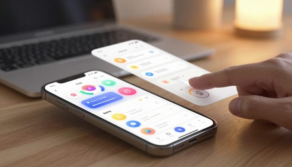
We begin with feedback microinteractions that confirm actions and reduce uncertainty. Toast notifications, inline success and error states, and loading spinners fit this category. Use transient feedback for quick confirmations and persistent states when users may need to revisit a result. Wording matters: short, action-oriented copy improves comprehension. Timing matters: brief delays or pauses can make feedback feel human. Material Design and Apple Human Interface Guidelines give clear patterns for toasts and success states that balance visibility with nonintrusiveness.
Next we cover affordance and invitation microinteractions that show where users can act. Hover states, focus rings, drag handles, and subtle highlights are classic affordance cues. On pointer devices, hover can reveal extra controls; on touch devices, focus and tap targets must make intent obvious without relying on hover. We recommend progressive disclosure: surface affordances only when relevant to avoid clutter while keeping discoverability high.
Transition and motion microinteractions handle movement between states. Entrance and exit animations, state-change easing, and continuity morphs fall under transition animations. Use easing to guide attention and animated iconography to signal progress. A morphing button that changes from “Add” to “Added” gives immediate context. Keep performance and accessibility in mind: provide reduced-motion alternatives and keep durations short to avoid disorientation.
We pair design intent with practical rules: match feedback microinteractions to user goals, make affordance cues discoverable across device types, and use transition animations to connect states without distracting. This balanced approach to types of microinteractions supports smoother flows and clearer communication in modern UI design.
UI Microinteractions
We use the term UI Microinteractions to focus teams on the small, intentional moments that shape user experience. This vocabulary turns vague ideas about “polish” into concrete artifacts that product, design, and engineering can measure and iterate. Calling these moments microinteractions helps everyone prioritize testable behaviors over cosmetic tweaks.

Why this term is central to interaction design
When we name a thing, we can design it: microinteractions frame decisions as triggers, rules, feedback, and loops. That shared language reduces ambiguity in sprint planning and lets QA write clear acceptance criteria. Teams at Apple and Google use similar taxonomies inside iOS Human Interface and Android Material guidelines to align expectations across disciplines.
Examples across platforms: mobile, web, and desktop
On mobile, common microinteractions include pull-to-refresh animations and toggle states that provide immediate UI feedback. Touch input and latency constraints shape the motion and duration we choose.
On the web, inline form validation, transient toasts, and animated loaders communicate state without blocking tasks. Web standards and browser performance influence which techniques we adopt.
On desktop, hover previews, dock bounce behaviors, and window state transitions offer rich feedback for mouse and keyboard users. Operating system conventions and input diversity guide our implementation choices.
How the phrase guides cross-team conversations
We recommend a shared taxonomy—trigger, feedback, rules—during story mapping and grooming. Using these terms makes acceptance criteria explicit and helps engineers estimate effort accurately. Designers can hand off prototypes with labeled microinteractions so developers reproduce UI feedback precisely.
Clear naming improves collaboration between product managers, designers, and engineers. It speeds reviews, tightens QA tests, and raises the chance that microinteractions will boost user engagement rather than create confusion.
Designing Microinteractions: A How-to Workflow
We map practical steps for designing microinteractions so teams can move from idea to tested pattern. This short how-to guide centers on an interaction workflow that ties user journeys to measurable outcomes in UX design.

Identify key moments in the user journey
We start by mapping task flows and user journeys to reveal friction points and moments of delight. Focus on onboarding, error states, confirmations, and empty screens where microinteractions yield high ROI.
Use analytics and session replay tools to prioritize which moments to address first. Select targets that show high drop-off or repeated friction.
Define intent, trigger, rules, feedback, and loops
For each selected moment, document five elements: intent (what users expect), trigger (what starts the interaction), rules (state transitions), feedback (visual, audio, haptic), and loops (repetition or escalation). This keeps the interaction workflow readable and testable.
Set acceptance criteria and performance budgets: response time, animation duration, and resource limits. We include engineering early to surface constraints and avoid rework.
Create low-fidelity prototypes and test quickly
Sketch ideas on paper, build clickable flows in Figma, or use Principle for motion tests. Low-fidelity prototypes let us validate comprehension and emotional response without heavy investment.
Run rapid usability sessions with 5–8 participants to observe real behavior. Iterate in short cycles: prototype, test, refine. Capture metrics for task success and perceived ease to feed back into the interaction workflow.
Best Practices for Microinteraction Animation and Timing
We focus on motion as a communication layer: subtle movement explains cause and effect, guides attention, and makes interfaces feel alive. Thoughtful use of easing and duration helps users predict results without distraction. Good microinteraction timing keeps pace with intent and task flow.

Establishing natural easing and duration
We recommend clear timing windows for consistent behavior. Use 20–100ms for micro-feedback such as button ripples, 100–300ms for quick transitions, and 300–500ms for complex morphs. Match easing curves to intent: ease-in-out and cubic-bezier functions mimic physical motion and make state changes feel natural.
Using motion to communicate state changes
Motion should clarify, not confuse. Use fades to indicate dismissal and slide-ins to show spatial relationships between panels. Preserve continuity: maintain object scale and position across transitions so users trace cause and effect easily.
Performance considerations and accessibility impacts
Prefer transforms and opacity over layout changes to avoid repaint and reflow. Use hardware-accelerated CSS where possible and test on devices from Apple and Samsung to measure frame-rate and battery impact. Respect prefers-reduced-motion media queries and offer a reduced-motion setting to protect users with vestibular disorders.
We balance delight with control: allow users to pause or disable nonessential animations. Keep microinteraction timing short for routine feedback and slightly longer when you need to teach or confirm. Track performance metrics and iterate when frame drops or high CPU usage appear.
| Use Case | Recommended Duration | Easing Example | Performance Tip |
|---|---|---|---|
| Button ripple / tactile feedback | 20–100ms | ease-out | Use opacity/scale transforms |
| Quick UI transitions (menus, toasts) | 100–300ms | ease-in-out | Animate composited properties |
| Complex morphs / onboarding | 300–500ms | cubic-bezier(0.2,0.8,0.2,1) | Limit simultaneous animations |
| Spatial page shifts (drawers, panels) | 150–350ms | ease-out-cubic | Use translate3d for GPU acceleration |
| Visual confirmation (success states) | 80–200ms | ease-in | Prefer opacity changes when possible |
Microinteractions That Improve User Engagement
We prioritize micro-details that shape how people feel during interaction. Small UI Microinteractions can guide attention, reduce friction, and build trust. Below we outline practical patterns you can adopt to lift engagement without adding complexity.

Use clear, timely feedback so users know a system is working for them. Confirmation indicators such as inline checkmarks, subtle toasts, progress bars, and skeleton screens cut anxiety and boost confidence. For long tasks, provide granular feedback: percent complete, time estimates, and intermediate confirmations keep users informed.
We recommend short visual cues that match the task size. An inline checkmark after a save feels immediate. A progress bar for uploads sets expectations. A skeleton screen during data loads signals that content is coming, which raises perceived speed and trust.
Lightweight gamification can elevate routine flows without feeling childish. Consider streaks, badges, celebratory micro-animations, and pointed reward microcopy to mark milestones. Duolingo and Fitbit show how minimal gamified UI Microinteractions increase return visits when done respectfully.
Keep gamification concise and user-focused. Use microcopy that celebrates achievement but avoids patronizing language. Pair badges with meaningful context so rewards connect to real value, not empty points.
Personalization cues and contextual prompts tailor interaction to individual needs. Smart suggestions, adaptive tooltips, and nudges that reflect recent behavior reduce decision time and increase relevance. Personalization must center consent: explain data use and provide clear opt-outs.
Design these cues as lightweight, reversible choices. Let users accept or dismiss suggestions and make settings discoverable. Respect for privacy turns personalization into a trust amplifier rather than a source of frustration.
To summarize actionable tactics:
- Confirmation indicators: use checkmarks, toasts, progress bars, skeleton screens for clarity.
- Engagement microinteractions: favor brief animations and percent-based feedback for longer tasks.
- Gamification: apply streaks, badges, and reward microcopy sparingly and meaningfully.
- Personalization: offer adaptive prompts with explicit consent and easy opt-outs.
Implementing Microinteractions in Code
We move from design intent to working code by focusing on pragmatic patterns for implementing microinteractions. This section shows compact techniques for lightweight motion, event-driven behavior, and sensible use of frameworks. The goal is predictable, testable UI Microinteractions that perform well on real devices.

CSS and SVG techniques for lightweight animations
Favor CSS animations for simple transitions: use transform and opacity for composited changes to keep the main thread free. Transitions and keyframes cover most cases: hover fades, scale feedback, and subtle entrance motion. Reserve will-change for critical elements and use it sparingly to avoid memory churn.
For line-draw effects and icon motion, use SVG animation tricks like stroke-dasharray combined with stroke-dashoffset. Animate the offset with CSS keyframes or from JavaScript to reveal paths smoothly. Keep SVGs compact and prefer vector shapes over bitmap sequences for crisp, low-cost motion.
Always test on mid-range devices. Offload animations to the compositor by animating transform and opacity. Avoid animating layout properties such as width or top when performance matters.
JavaScript event-driven patterns for interactive feedback
Use JavaScript patterns that match interaction speed: debounce rapid input events, throttle scroll handlers, and schedule visual updates with requestAnimationFrame for frame-synced motion. These techniques reduce jank and keep microinteractions feeling immediate.
Model complex interaction rules as finite state machines. Libraries like XState help when microinteraction flows have many states or cancellations. Encapsulate state logic so CSS handles the presentation while JavaScript controls the trigger and rules.
Integrate CSS-driven animations with JS by toggling classes, reading computed styles when necessary, and listening for transitionend or animationend events to sequence actions. This keeps markup simple and separates style from logic.
Using frameworks and libraries responsibly
Select tools that solve a real problem: GreenSock (GSAP), Framer Motion for React, and Anime.js excel for complex timelines or physics-based motion. Prefer native CSS for trivial cases to minimize bundle size and runtime cost.
Adopt a component-driven architecture: encapsulate microinteraction behavior inside reusable components and expose hooks for customization and testing. That approach supports consistent UI Microinteractions across teams and platforms.
Audit runtime and bundle impact. Lazy-load heavy libraries for noncritical pages and provide fallbacks based on prefers-reduced-motion. Use unit tests and visual regression checks to keep microinteractions stable as the codebase evolves.
Testing and Measuring the Impact of Microinteractions
We treat microinteractions as experiments: small interface details that can change user behavior. Before we instrument events, we clarify goals and success criteria. That clarity keeps testing focused and helps when measuring UX impact across design and engineering teams.

Qualitative methods reveal why a microinteraction feels right or wrong. For moderated usability testing we use task-based scenarios and think-aloud prompts to surface friction points. In unmoderated sessions we record targeted interactions and short interviews to capture emotional response. A/B tests help validate microcopy and animation variants, while interviews dig into preference and perceived value during usability testing.
Quantitative metrics give us objective signals we can track over time. We instrument events for triggers, durations, and abandonment points to measure task success and error rates. Key performance indicators include conversion rate, time on task, completion rate, and engagement metrics like click-through and retention. We pair these numbers with sentiment scores from post-task surveys to enrich measuring UX impact.
We prioritize fixes using an impact-versus-effort approach. Each microinteraction change becomes a hypothesis: we define an expected outcome, run controlled tests, and evaluate statistical significance. Iteration relies on both analytics and direct user feedback so we can refine animation timing, feedback wording, or trigger sensitivity based on real use.
To keep work actionable we add concrete tickets to the product backlog with measured baselines and target improvements. We repeat short test cycles, roll out winners gradually, and monitor engagement metrics to confirm sustained gains. This loop—test, measure, iterate—turns small UI Microinteractions into measurable product value.
Accessibility Considerations for Microinteractions
We design UI Microinteractions to be inclusive: small motion, clear feedback, and user control make interfaces usable for more people. This short guide shows practical steps to reduce barriers while keeping interaction quality high.
Start by honoring user motion preferences. Use the prefers-reduced-motion media query to detect when someone opts out of animation. Offer an in-app toggle so users can disable non-essential motion. Replace long or complex transitions with instant state changes or subtle fades when motion is reduced.
We ensure screen reader compatibility by announcing dynamic updates. Implement ARIA live regions for status messages and provide proper role attributes for interactive controls. Keep DOM changes predictable so VoiceOver, NVDA, and other assistive tech reliably read state changes.
Keyboard navigation must be seamless. All interactive microinteractions should support keyboard triggers and logical focus order. Provide visible focus indicators and follow WAI-ARIA patterns for menus, dialogs, and custom controls.
Contrast, timing, and control options shape accessibility outcomes. Enforce WCAG contrast ratios for any visible feedback and avoid fleeting messages that trap users. Add pause, extend, and dismiss controls for ephemeral notifications to prevent missed content.
Test with real tools and people: try VoiceOver on macOS, NVDA on Windows, and keyboard-only flows on Chrome and Firefox. We measure effectiveness by observing task success and collecting direct feedback from users with low vision or motion sensitivity.
Use this quick reference table to compare common approaches and their accessibility trade-offs.
| Scenario | Accessible Approach | Why it works |
|---|---|---|
| Animated confirmation after form submit | Use prefers-reduced-motion to show instant state or subtle fade; add ARIA live success text | Respects motion preference and ensures screen reader compatibility |
| Tooltip on hover | Show on focus as well; maintain keyboard navigation and visible focus ring | Makes affordance available to keyboard users and assistive tech |
| Auto-dismissing toast | Provide pause/extend/dismiss controls and announce via ARIA live region | Prevents loss of information and improves accessibility for varied reading speeds |
| Complex motion-driven status | Offer plain text alternatives and an option to disable motion in settings | Ensures content remains accessible without relying on motion cues |
| Custom toggle or switch | Apply correct role, aria-checked state, and support keyboard navigation | Enables predictable interaction for assistive technologies and keyboard users |
Common Mistakes and How to Avoid Them
We often see promising designs stumble because small choices compound into poor experiences. This short guide highlights recurrent microinteraction mistakes and gives clear, practical fixes we can apply in product teams.
Overuse of animation and cognitive overload
Too many moving parts make interfaces noisy and slow task completion. Animation overuse creates distraction: users take longer to scan content and lose focus.
We recommend a simple heuristic: limit to one intentional microinteraction per distinct user action. Keep motion short, purposeful, and tied to feedback—use a single 200–350ms duration range for most transitions.
Ignoring cross-device consistency
Designs that rely on hover or precise pointer input often break on touch. Cross-device microinteractions must adapt to both input type and screen size to avoid inconsistent behavior.
We advise using design tokens and responsive patterns so states and timing remain consistent across mobile, tablet, and desktop. Test affordances on iOS, Android, Chrome, and Safari to catch platform-specific quirks early.
Neglecting performance and load-time impacts
Heavy animation scripts and oversized motion libraries increase bundle size, drop FPS, and drain battery on phones. Poor performance turns clever UI Microinteractions into liabilities.
Mitigation strategies include code-splitting and lazy-loading animation code, preferring GPU-friendly CSS transforms instead of layout-triggering properties, and measuring FPS during prototyping. Audit bundles with Lighthouse or WebPageTest to keep runtime cost low.
Below is a compact comparison to help prioritize fixes when we spot microinteraction mistakes in a product review.
| Problem | Symptoms | Immediate Fix | Long-term Approach |
|---|---|---|---|
| Animation overuse | Slow task completion, user distraction, increased cognitive load | Remove nonessential motions and shorten durations to 200–350ms | Establish motion guidelines and teach designers intent-based animation |
| Cross-device inconsistency | Hover-only cues fail on touch, layout shifts across viewports | Provide touch-friendly alternatives and test on real devices | Use design tokens and responsive interaction patterns |
| Performance regressions | Low FPS, long initial load, higher battery use on mobile | Switch to CSS transforms and defer heavy scripts | Adopt code-splitting, lazy-loading, and continuous performance budgets |
Tools and Resources for Designing Microinteractions
We rely on a mix of design and developer resources to craft UI Microinteractions that feel crisp and purposeful. Below we map practical options for designers and engineers, plus sources of inspiration and reusable patterns you can catalogue in a design system.
Design tools
Figma supports rapid prototyping and Figma microinteractions through Smart Animate, interactive components, and interactive variants. For higher-fidelity motion, Principle and ProtoPie let teams author complex gestures and timeline-driven transitions. After Effects remains the tool of choice for frame-by-frame choreography; export vector animations to Lottie for lightweight web and mobile delivery.
We recommend using design tokens, shared component libraries, and version control to keep motion specs consistent. Treat microinteraction tools as part of the component handoff: annotate triggers, durations, easing, and state rules alongside artboards.
Developer resources
Front-end engineers often turn to Framer Motion for React-driven transitions, GreenSock (GSAP) for high-performance timelines, and Anime.js for concise, chainable animations. GitHub and CodePen host example snippets for toggles, loaders, and progress indicators that accelerate implementation.
When choosing motion libraries, prioritize performance and accessibility: prefer composited transforms, debounce event listeners, and provide reduced-motion fallbacks. Keep code snippets modular so UI Microinteractions can be tested and reused across projects.
Inspiration and pattern libraries
Pattern libraries and curated galleries help teams spot patterns worth adapting. Material Design motion guidelines offer clear rules for timing and intent. Pattern Tap, UI-Patterns, Dribbble, and Behance supply visual ideas that teams can adapt for product constraints.
We encourage cataloging internal examples in a company pattern library to ensure reuse, speed up design decisions, and reduce duplicated effort across products. That practice turns isolated experiments into a living set of microinteraction tools for the whole organization.
Conclusion
We’ve shown that UI Microinteractions are small, focused UX design moments with outsized impact. When we apply the five-element framework—intent, trigger, rules, feedback, and loops—we turn tiny behaviors into clearer workflows, stronger trust, and genuine delight for users. Thoughtful interaction design sharpens usability and makes interfaces feel intelligent and humane.
Our practical workflow is straightforward: identify high-impact moments in the journey, define rules and feedback, prototype quickly, implement with technical discipline, and measure outcomes. By running small experiments and auditing products for microinteractions, teams can boost user engagement and iterate toward measurable gains without overhauling the whole product.
We believe designers and engineers working together can transform technical education and product quality. Embrace accessibility-first practices, test rigorously, and treat microinteractions as continuous work: small refinements compound into large improvements in UX design and user engagement.