Kinetic Typography in Advertising: Turning Words Into Visual Stories
In an era of shrinking attention spans and infinite content streams, the words brands choose to show — and how they move — have become one of the most powerful creative levers in modern advertising. Kinetic typography is no longer a niche design technique; it is the visual language of digital storytelling.
The Cinematic Origins: Beyond the Page
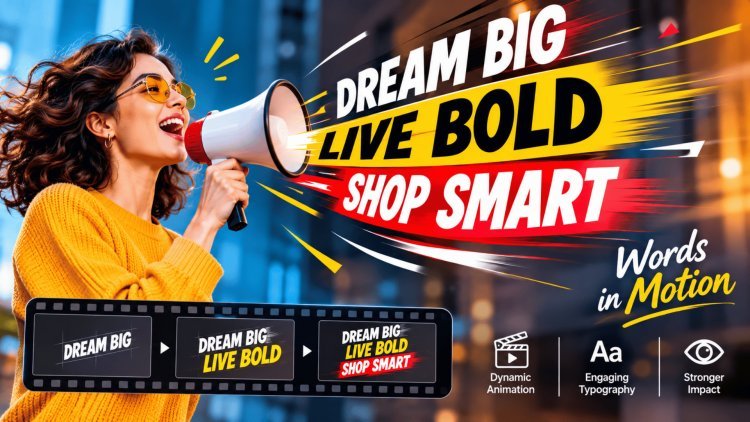
Kinetic typography — the art of animating text to express ideas, rhythm, and emotion — did not originate in a marketing boardroom. It was born in the golden age of cinema, where visionary directors and designers discovered that words in motion could do what static type never could: evoke tension, wonder, and anticipation before a single scene had played.
From Screen to Story
The 1960 title sequence for Alfred Hitchcock's Psycho, designed by Saul Bass, is widely credited as a landmark moment in kinetic typography. Stark, slicing text fragments that flew across the screen mirrored the film's psychological menace — proving that letterforms could carry emotional weight independent of their literal meaning.
This was text as performance, not just information.
Similarly, the opening titles of James Bond films used motion, color shifts, and rhythm to establish tone and character before the story began. These early experiments demonstrated a fundamental truth: the way a word moves changes what that word means.
The Core Mechanics of Moving Text
Unlike static layouts, kinetic typography operates across the dimension of time. Designers working in this medium use a toolkit of motion-based storytelling techniques that shape how information is perceived and remembered.
Single Moment
Visual Information
Passive Reading
Limited Emotional Range
Time-Based Narrative
Emotional Direction
Active Experience
Cinematic Expression
Together, these elements transform simple text into a powerful narrative device. The screen becomes a stage, and every word becomes an actor with a cue.
The Digital Transformation: From Art to Ad
What began as a cinematic art form has evolved into one of advertising's most strategically deployed tools. As social media platforms rewrote the rules of content consumption — autoplay, silent viewing, vertical screens, and two-second scroll decisions — brands were forced to rethink how words could do more than describe. They needed words that could perform.
The Silent Autoplay Revolution
Studies show that over 85% of social media videos are watched without sound. This seismic shift in viewing behavior forced advertisers to rethink their entire approach. Motion-driven text stepped into the void left by audio — carrying tone, urgency, and persuasion through kinetics alone. Platforms like Instagram, TikTok, and LinkedIn became the new proving grounds for kinetic typography, where a well-timed word drop outperforms a glossy product shot in stopping power.
of social media videos are watched without sound.
Typography as Visual Choreography
Modern digital marketing teams now treat typography not as a finishing touch but as a primary creative element. The discipline of "visual choreography" has emerged — where every word is assigned a motion path, a timing, and a purpose within the broader narrative arc of an ad. This approach reduces cognitive load dramatically: rather than processing image, voiceover, and copy simultaneously, viewers receive one clear message at a time, delivered through motion. Research in visual communication confirms that motion-guided text improves message recall by up to 40% compared to static equivalents.
improvement in message recall compared to static equivalents.
Memory, Emotion & Retention
The shift from image-heavy campaigns to motion-driven text is not merely aesthetic — it is rooted in cognitive science. When text moves in ways that mirror natural speech rhythm or emotional cadence, the brain processes it more like a lived experience than a read message. This creates stronger emotional imprinting and longer-lasting brand recall. Forward-thinking agencies now build kinetic typography strategies before they write a single line of copy, treating motion as the medium through which language achieves its full persuasive potential.
Motion becomes the medium through which language achieves its full persuasive potential.
The Future of Visual Communication
Kinetic typography has completed a remarkable journey — from the title sequences of mid-century cinema to the most-watched content on the planet's largest digital platforms. As technology continues to evolve and consumer behavior grows ever more fragmented, moving text stands positioned not as a trend but as a durable, adaptable, and deeply human form of communication.
As CSS animation, WebGL, and browser-native motion capabilities advance, kinetic typography is moving beyond video into interactive web experiences. These are all emerging as standard tools in the brand designer's kit:
The cluttered digital landscape demands creative evolution — and kinetic type is rising to meet it.
The brands that will lead the next decade of visual communication are not those with the most elaborate motion effects — they are those that prioritize:
The goal of kinetic typography is never to dazzle; it is to ensure that every word lands with the precision and impact it deserves.
Motion is a service to meaning, not a substitute for it.
At its core, kinetic typography is a philosophy as much as a technique. It asserts that language is inherently visual — that the shape, weight, timing, and movement of a word are as expressive as the word itself.
By honoring this truth, brands can transform even the most ordinary copy into an experience that resonates long after the video ends — making every campaign not just seen, but remembered.
What's Your Reaction?