
We introduce a concise how-to manual for engineers, educators, students, and UX practitioners who want to shape attention and improve task success. This guide explains what visual hierarchy is, why layout design matters, and how practical UX principles help us guide users through interfaces with clarity and purpose.
Our mission is to transform technical education through imagination and innovation: we blend the Sage’s evidence-based thinking with the Creator’s experimental drive. We write as a team—clear, professional, and approachable—so design hierarchy becomes a shared skill you can apply in product teams, classroom assignments, and research projects.
Readers can expect concrete outcomes: we define and measure visual hierarchy, cover perception principles that inform layout design, and show typographic, color, responsive, and interaction techniques. We include testing methods, common mistakes, and real-world examples so you can move from concept to measurable improvement in usability, conversions, and accessibility compliance.
Format-wise, we offer step-by-step explanations, actionable tactics, testing checklists, and recommended tools. Each section focuses on practical application—so you can prototype faster, test more reliably, and present results with clarity.
Key Takeaways
- Visual Hierarchy frames what users see first and why: it is central to effective layout design.
- Applying core UX principles makes interfaces easier to scan and tasks easier to complete.
- Typography, color, and spacing are practical levers for creating a usable design hierarchy.
- Responsive strategies and microinteractions keep hierarchy intact across devices.
- Testing and metrics turn design decisions into measurable improvements.
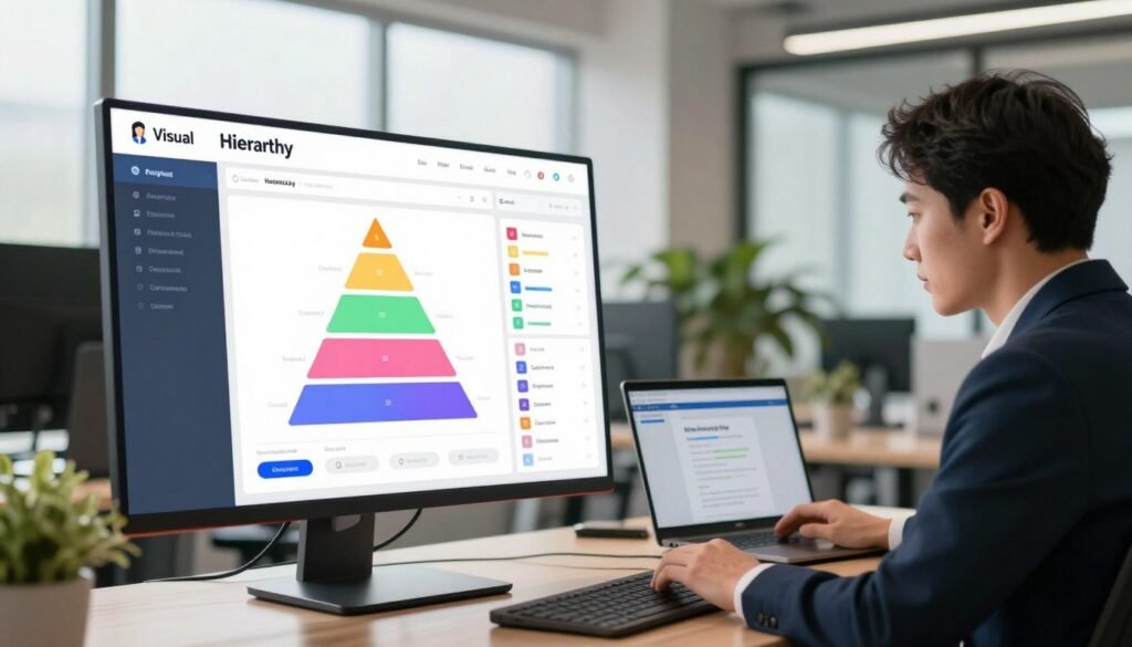
Understanding Visual Hierarchy
We frame visual hierarchy as the director of a stage: it tells users where to look first and why. When done well, it reduces mental effort, guides decisions, and makes interfaces feel effortless. This section breaks the idea into clear parts so teams can apply it to product work.

Definition and core concepts
Visual hierarchy is the arrangement of elements to show their relative importance. Core concepts include emphasis, order, focal points, affordance, and visual weight: each factor shapes scanning behavior. Think of emphasis as a spotlight and order as the script that sequences actions.
Simple techniques create hierarchy: scale for importance, contrast for focus, and proximity for grouping. Affordance signals what is interactive; clear affordance cuts hesitation and speeds task completion.
Why visual hierarchy matters for UX and conversion
We prioritize hierarchy because it lowers cognitive load and improves measurable outcomes. Strong hierarchy shortens time-on-task and boosts task success rates. It tends to reduce bounce and lift conversions when calls to action are unmistakable.
Evidence-based design uses A/B testing and analytics to validate choices. Small changes to emphasis or placement often produce outsized gains in retention and conversion uplift.
How visual hierarchy ties to layout design and content strategy
Visual hierarchy sits at the intersection of layout design and content strategy. Layout design places elements in space: grids, columns, and margins set the stage. Content strategy decides which message earns prominence.
We map business goals—like signups or purchases—to user goals—such as finding answers quickly—and assign visual prominence accordingly. Wireframes and content briefs become the tools that align editorial priority with visual weight.
When designers and content strategists work together, the result is consistent scanning paths and clearer decisions for users. That alignment transforms intent into action across screens and contexts.
Principles of Perception That Inform Layout Design
We begin with a quick map of how perception shapes effective layout design. Designers who apply core UX principles work with human instincts, not against them. This yields interfaces that guide attention, reduce friction, and tell a clear story through visual hierarchy.

Gestalt principles relevant to interface layout
Proximity groups related items: place labels near fields and cluster navigation links so users scan less and act faster. Similarity uses shared color, shape, or typography to signal function—buttons that match in color read as a family. Continuity creates smooth scanning paths: align headlines and images along invisible lines to lead the eye. Closure lets users infer shapes from fragments: partial borders or cut-off cards can suggest containers without visual clutter. Common fate ties motion to grouping: small, synced animations show which items change together.
Visual weight, figure-ground, and grouping
Visual weight depends on size, color contrast, and complexity: large bold headlines carry more weight than light captions. Use weight to mark primary actions and to balance pages. Figure-ground clarifies what is interactive: clear contrast and spacing keep foreground elements readable and prevent ambiguous affordances. Grouping strategies combine alignment, spacing, and shared styles so primary content reads first and secondary details follow. When we design a dashboard or a product listing, these cues produce predictable scanning paths.
Applying perception psychology to user flows
We translate theory into practice by mapping user intent to perceptual cues. For onboarding, emphasize one clear step with size and contrast; follow-up steps use lighter weight and proximity to show sequence. In checkout flows, reduce visual noise and raise the visual weight of total cost and CTA to lower dropout. For search results, group metadata with similarity and use continuity to connect items to filters.
Practical steps we use: wireframe primary, secondary, and tertiary zones; prototype microtransitions to test common fate; run quick usability checks to confirm scanning order. These actions fold Gestalt principles into layout design and support UX principles that make interfaces intuitive.
Visual Hierarchy
We begin by treating visual hierarchy as a diagnostic layer of layout design. A clear audit reveals what users see first, what they ignore, and where attention splits. The goal is to map hierarchy patterns to user intent so teams can iterate with purpose.

How to identify existing hierarchy in your designs
Start with simple, repeatable tests. Convert a screen to grayscale to check emphasis without color bias. Run eye-tracking heatmaps or click maps to gather behavioral evidence. Pair those outputs with a structured heuristic review focused on prominence, contrast, and affordance.
Use an audit checklist to make findings actionable:
- Primary element — the top visual anchor users reach for first.
- Secondary elements — supportive content that guides the next step.
- Tertiary elements — background links or legal copy that should not compete.
- Scanning order — the natural sequence users follow across components.
- Conflicting cues — elements that fight for attention and create noise.
Common hierarchy patterns in websites and apps
Recognize familiar structures and match them to your goals. The F-pattern works well for content-heavy pages where scanning lines dominate. Z-patterns suit landing pages that steer readers from hero to CTA in a predictable diagonal flow.
Hero-first layouts place a dominant visual at the top to convey the main offer quickly. Card-based modularity shines for catalogs and dashboards because it supports quick comparisons and responsive shifts. Desktop apps often rely on left-nav emphasis for deep exploration. Mobile experiences favor bottom navigation to align with thumbs and task flows.
Choosing a pattern depends on context: informational sites benefit from F-patterns, while task-driven apps gain clarity from left-nav or bottom nav structures.
Metrics and user testing for hierarchy effectiveness
Measure both behavior and perception. Quantitative metrics include time-to-first-action, task success rate, and click distribution across primary and secondary elements. These numbers show whether the layout design guides users as intended.
Qualitative methods reveal the why: think-aloud usability tests and moderated sessions surface confusion, expectations, and language mismatches. We recommend tools that combine playback with notes: Hotjar and FullStory for behavioral recordings, Lookback and UserTesting.com for moderated insights.
Blend metrics from analytics with findings from UX testing to validate changes. Iterate using small A/B tests or prototype sessions until the visual hierarchy aligns with the desired user journey.
Typography Techniques to Guide Users
We view typography as a core instrument in shaping visual hierarchy and guiding readers through content. Clear choices in size, weight, and spacing make interfaces easier to scan and support strong UX principles. Below we outline practical tactics that fit modern layout design and create a readable hierarchy for technical and educational content.

Size, weight, and scale for emphasis.
Larger size and bolder weight create dominance: use them to show primary actions and headings. A practical scale uses 1.25–1.5x increments between levels—body text at 16px, subheads at 20px–24px, and H1-style headings larger still. This rhythm gives users predictable stops as they scan a page and strengthens the visual hierarchy without adding clutter.
Type pairing and readable hierarchy.
Pair a serif for long-form passages with a neutral sans-serif for UI labels to balance personality and legibility. Choose one display face for emphasis and one neutral face for body copy. Maintain contrast between headings, subheads, and body: high contrast for anchors, medium contrast for supporting lines, low contrast for tertiary notes.
Leading, tracking, and spacing to control scanning.
Line-height around 1.3–1.6 improves comprehension for dense technical text. Increase leading slightly for long explanations and narrow the measure to 60–75 characters per line. Letter spacing (tracking) can reduce crowding for uppercase labels; small positive tracking helps legibility at larger sizes.
Small paragraph spacing and consistent margins guide the eye through modules in grid-based layout design. Use white space to separate blocks so readers can form quick mental groups. These adjustments align typography with UX principles and make the page easier to parse at a glance.
For dense tables or code blocks, raise leading and reduce measure further: this reduces strain and improves scan speed for engineers and students. When type becomes a visual anchor, maintain restrained contrast so emphasis reads as signal, not noise.
Finally, test combinations in real contexts: prototypes in Figma or Adobe XD expose where scale, pairing, and spacing fail. Iteration ensures a readable hierarchy that supports user goals and strengthens the overall layout design.
Color and Contrast Strategies
We treat color as a directional tool that shapes visual hierarchy and guides attention. Thoughtful color strategies let us create focal points, support layout design, and reinforce core UX principles without cluttering the interface.

Using color to create focal points
Accent colors act as magnets: a bold hue on a primary call-to-action draws the eye faster than size changes alone. We recommend limiting primary accents to one or two actions per screen to avoid competing signals. Muted palettes work well for backgrounds so that saturated accents stand out. Adjust hue, saturation, and brightness to move elements forward or back in the visual stack.
Contrast for legibility and emphasis
Contrast does double duty: it improves legibility and signals importance. Aim for WCAG contrast ratios at or above 4.5:1 for body text and 3:1 for larger UI labels. Icons and small UI text should meet the higher target to remain clear on varied displays. Low contrast flattens hierarchy and slows scanning; good contrast makes scanning rapid and confident.
- Text: 4.5:1 minimum for normal size, 3:1 for large text
- Icons and separators: prefer 4.5:1 to keep affordances visible
- CTAs: use contrast plus saturation shifts to prioritize actions
Accessible color choices and ARIA considerations
We never rely on color alone to convey meaning. Pair colored states with text labels, distinct shapes, or icons so users with vision differences can interpret controls. Use ARIA attributes for state changes: aria-pressed, aria-invalid, and live regions help assistive tech report changes that color signals alone cannot.
Practical tools speed validation: designers commonly use WebAIM’s Contrast Checker and the Stark plugin for Figma during reviews. These tools help us test palette decisions against WCAG targets and refine color strategies early in the design process.
When color, contrast, and layout design align with clear UX principles, interfaces become more accessible and easier to scan. That alignment improves task success while preserving a clean, intentional aesthetic.
Layout and Composition Tactics
We approach layout design as a set of deliberate choices that shape how users scan and act. Clear composition supports visual hierarchy and aligns with UX principles to guide attention. Below we outline practical tactics for grids, white space, and when to pick modular or freeform systems.

Grid systems and alignment
We favor predictable grids: 12-column responsive grids and baseline grids for typographic rhythm. These frameworks let us align CTAs, headlines, and imagery along consistent lanes so users scan predictably. Use column gutters to set visual beats and baseline grids to harmonize line-height across breakpoints.
For CTAs, align the primary action to a repeating column edge or center line to create a landing spot. For imagery, align image edges to text blocks to form clear scanning paths. Small shifts in alignment can change perceived priority and strengthen visual hierarchy.
White space as a tool
We treat white space as active negative space that isolates important elements and raises perceived value. Generous padding and margins give components room to breathe. That breathing room reduces cognitive load and makes primary messages easier to parse.
Apply larger margins around hero CTAs and headlines, tighter spacing for supporting details. Use asymmetrical white space to create emphasis: an empty zone beside a product tile highlights its presence without extra ornament.
Modular layouts vs. freeform composition
Modular systems use repeatable cards and modules. They scale well for product catalogs, dashboards, and component libraries. Modules keep interactions consistent and speed up development, which reinforces UX principles across pages.
Freeform composition works when narrative or immersion matters: editorial features, longform storytelling, and immersive brand pages. Controlled freeform designs let us break the grid intentionally while maintaining a core alignment to preserve visual hierarchy.
| Aspect | Modular | Freeform |
|---|---|---|
| Best use | Catalogs, dashboards, e-commerce listings | Editorial features, immersive storytelling, campaigns |
| Scalability | High: components repeat reliably | Moderate: requires bespoke layouts per page |
| Consistency | Strong: predictable patterns aid users | Variable: visual interest can trade off consistency |
| Control of visual hierarchy | Precise: alignment and spacing enforce priority | Intentional: emphasis relies on composition and white space |
| Implementation speed | Faster: reusable modules reduce design time | Slower: bespoke layouts need more iteration |
| When to choose | When uniform scanning and predictable tasks matter | When narrative flow or brand expression drives engagement |
We recommend starting with grid systems for most interfaces, adding controlled freeform elements when the product needs narrative moments. By combining disciplined alignment with thoughtful white space, teams create layout design that supports clear visual hierarchy and follows sound UX principles.
Imagery and Iconography in Visual Hierarchy
We use imagery and iconography to anchor messages and guide attention through a layout design. Thoughtful visuals shape the first impression, support scanning behavior, and reinforce key actions defined by UX principles.

Choosing images that support the main message
Pick photos or illustrations that match the content’s tone and purpose. Contextual photos show use in real settings; illustrations simplify complex ideas; charts and data visualizations summarize insights quickly.
Respect licensing and page speed: choose compressed formats and responsive variants. Optimized images keep pages fast and preserve the visual hierarchy on slow connections.
Scale and placement of visual elements
Scale controls emphasis: hero imagery sets the initial frame, while smaller supporting visuals should not compete with primary CTAs. Use cropping and focal points to direct gaze toward the action.
Apply the rule of thirds and clear alignment to maintain predictable scanning. Placement within grids ensures visuals enhance layout design without creating clutter.
Icons for quick comprehension and affordance
Icons speed recognition and signal affordance when they follow a consistent visual language. Choose simple metaphors and scalable SVGs so icons remain crisp at any size.
Label critical icons to remove ambiguity and meet accessibility needs. When icons align with UX principles, they improve task speed and reduce cognitive load.
- Tip: Prioritize imagery that reinforces hierarchy—lead with the strongest visual, then layer supportive elements.
- Tip: Keep iconography consistent across states and screens for reliable affordance.
- Tip: Test visual scale on multiple breakpoints to preserve the intended hierarchy.
Using Movement and Microinteractions
We use subtle motion to make interfaces feel alive and clear. Thoughtful animated cues guide attention toward important elements and reveal changes in state. In product work at companies like Google and Apple, restrained motion supports visual hierarchy instead of competing with content.
Animated cues to draw attention without distraction
Entrance animations, hover states, and guided transitions help users notice what matters first. Use short, purposeful movement: a fade-and-slide for new content, a scale on hover for interactive cards, or a subtle focus ring when a field gains input. Each cue should clarify layout design and scanning order.
Limit duration and complexity. Fast animations communicate urgency; slower ones imply flow. Test whether motion improves task completion before making it permanent.
Microinteractions that reinforce hierarchy and feedback
Microinteractions—button presses, loading indicators, success confirmations—confirm actions and strengthen UX principles. A primary CTA ripple on click signals the top action. Real-time form validation with brief color and icon changes prevents errors and keeps users moving through flows.
Progress animations in multi-step tasks highlight the current step and reduce anxiety. Use consistent motion language across components so microinteractions become predictable cues in the visual hierarchy.
Performance considerations and user control
Animation can improve clarity and hurt performance. Measure with Lighthouse and prioritize GPU-accelerated CSS transforms and opacity for smoother rendering. Avoid layout-triggering animations that force reflow.
Honor user preferences: respect reduced-motion media queries and offer toggles for motion-heavy features. When users can control or disable effects, accessibility improves and trust grows.
Responsive Design: Maintaining Hierarchy Across Devices
We design for change: screens vary from wrist to wall, and our layouts must keep meaning intact. Preserving a clear visual hierarchy while applying responsive design lets users find what matters fast. We focus on content priority, scalable type, and reliable testing across breakpoints to keep interactions smooth and intuitive.

Prioritizing content for smaller screens
On phones we collapse secondary blocks into accordions or tabs so the main task stays visible. Progressive disclosure helps: show the primary action first, then reveal details on demand. We place key controls within thumb reach and create distinct content hierarchies per breakpoint so each layout design communicates a single, dominant path.
Responsive typography and scaling strategies
Fluid type using clamp() gives smooth scaling between breakpoints and keeps line length readable. We use a modular scale to set consistent step sizes and adjust leading for narrower viewports to avoid dense paragraphs. If elements crowd the viewport we hide nonessential chrome or reflow components into stacked patterns to preserve the visual hierarchy and prevent confusion.
Testing hierarchy across breakpoints
We validate designs with a mix of device lab checks, browser DevTools responsive mode, and remote user tests on common phones and tablets. Key metrics include tap target size, scroll depth, and task success rate. Iterating from those signals helps refine layout design so UX principles translate from desktop to mobile with predictable results.
Content Strategy and Copywriting for Effective Hierarchy
We approach content strategy as a bridge between product goals and the user’s intent. Short, clear headings guide scanners. Descriptive subheads and the inverted-pyramid method keep the essential facts up top so engineers and educators find value fast.
Writing clear headings and scannable content
Use concise headings that state the outcome: what the user will learn or do next. Break long ideas into bulleted lists and bite-sized paragraphs. Bold one phrase per paragraph to make key points pop inside your visual hierarchy.
Prioritizing information with UX writing techniques
Map microcopy to user intent: labels that show affordances, inline help that prevents errors, and progressive disclosure for advanced settings. For form flows, place the most common action first, then add optional fields under a collapsible area.
Examples: error messages that tell the fix, not the problem; dashboard cards that present the metric, trend, and a single action. These tactics respect UX principles and keep content aligned with layout design.
CTA placement and persuasive hierarchy
Design a CTA hierarchy: primary action in the hero, secondary actions inline, tertiary options in footers or menus. Use sticky footers sparingly for long tasks. Copy should focus on benefit and outcome: “Run report now” beats “Submit.”
Limit urgency to contexts that merit it. Test CTA placement with real tasks to confirm gaze patterns match the intended visual hierarchy. Small changes in phrasing and position often yield measurable improvements in clicks and completion rates.
We blend technical clarity with persuasive structure so content strategy, visual hierarchy, UX principles, layout design, and CTA placement work together to reduce friction and increase task success.
Tools and Methods for Designing Hierarchy
We rely on pragmatic workflows to turn UX principles into clear, testable layouts. Practical tools help reveal problems fast: plugins that run contrast checks, inspectors that expose element order, and prototyping suites that show motion and timing. Below we list the main approaches and when to use them.
Design tools and plugins
Figma, Adobe XD, and Sketch form the backbone of modern layout design. Each supports plugins that speed up hierarchy inspection: Stark for accessibility audits, Contrast Checker for legibility, Content Reel for realistic copy, and layout inspector plugins that map z‑index and spacing. Use these plugins to audit contrast, measure spacing, and verify element order before moving to prototypes.
Wireframing and prototyping
Start with low‑fidelity wireframes to validate information scent and task flow. Sketch basic blocks, test scan paths, then move to high‑fidelity prototypes for prototyping microinteractions and transition timing. Figma prototypes and InVision work well for rapid sharing. Framer adds advanced motion when we need to test subtle attention signals.
Quantitative and qualitative testing
Quantitative methods give broad metrics: run A/B tests, monitor funnel analytics, and collect heatmaps to see where users fixate. Qualitative methods explain why: moderated usability tests, card sorting, and tree testing uncover mental models and content priorities. Choose quantitative when you need statistical confidence. Choose qualitative when you need insight to iterate on visual choices.
Interpreting results is iterative: use analytics to spot issues, run targeted usability sessions to diagnose causes, then refine designs with updated prototypes. Repeat hierarchy inspection and testing until scanning patterns align with intended goals.
| Method | Common Tools | What to Measure | When to Use |
|---|---|---|---|
| Plugin audits | Stark, Contrast Checker, layout inspector | Contrast ratios, spacing, DOM order | Early design reviews and accessibility checks |
| Wireframes | Figma, Sketch, Adobe XD | Priority of content, scan path | Concept validation and stakeholder alignment |
| Interactive prototypes | Figma prototypes, InVision, Framer | Microinteractions, transitions, user flows | Usability testing and stakeholder demos |
| Quantitative testing | Google Analytics, Optimizely, Hotjar | Conversion rates, click maps, time on task | Performance measurement and A/B validation |
| Qualitative testing | Lookback, UserTesting, moderated lab sessions | User reasoning, navigation choices, confusion points | Design refinement and content hierarchy decisions |
Common Visual Hierarchy Mistakes to Avoid
We often spot the same pitfalls in layout design that undermine clarity and task success. Small oversights compound: what begins as a subtle inconsistency becomes a barrier for users. We outline three frequent issues and pragmatic fixes that align with solid UX principles.
Overuse of emphasis and visual noise
When every element competes for attention, nothing stands out. Too many bolds, vivid colors, and animated cues create visual noise that dilutes intent and slows scanning. A crowded palette and mixed weight choices erase the focal point of a page.
Remedies are simple: reduce the color palette, harmonize type weights, and choose one primary action per view. We recommend design audits that remove redundant styles and enforce a clear emphasis hierarchy. This returns attention to core goals and improves conversion paths.
Conflicting cues and broken scanning paths
Users rely on predictable scanning patterns: left-to-right, top-to-bottom, and alignment-driven grouping. Competing alignments, inconsistent spacing, and mixed affordances break those flows. Buttons that look like links, cards with shifting margins, or headings that vary in rhythm all create friction.
Diagnose these problems by mapping common user journeys and running quick heatmap tests. Fixes include standardizing alignment, restoring consistent spacing scales, and unifying affordance language for interactive elements. Iterative prototypes help confirm that scanning paths are restored.
Ignoring accessibility and user diversity
Neglecting accessibility reduces comprehension for people with low vision, color blindness, or cognitive differences. Poor contrast, missing semantic markup, and broken keyboard support exclude real users and invite compliance risk.
Inclusive design steps are practical: ensure sufficient contrast ratios, use semantic HTML and ARIA roles, and support keyboard navigation. Test with screen readers and with diverse users to validate changes. These actions improve usability for everyone and strengthen the design’s resilience.
We advocate that teams bake accessibility and consistent hierarchy into early design decisions. Small rule sets—color limits, spacing scales, and a single primary CTA—cut down visual noise and prevent common visual hierarchy mistakes from becoming systemic.
Case Studies and Examples
We review practical visual hierarchy case studies that show how focused layout design delivers measurable gains. The examples below pair specific UX principles with clear interventions and outcomes. Each item is brief so teams can scan and apply the lessons.
Before-and-after redesigns that improved task success
One ecommerce site reduced time-to-checkout by simplifying the hero and moving the primary CTA above the fold. The team changed CTA color to a high-contrast accent, tightened copy, and removed competing promotional banners. Metrics rose: conversion rate increased and task success improved for first-time buyers.
Another product documentation portal reworked navigation and typographic rhythm. The redesign examples included larger section headings, consistent link affordances, and a left rail that prioritized common user journeys. Completion rates for key flows climbed as users found answers faster.
Real-world layout design examples from websites and apps
Apple product pages demonstrate tight hierarchy: a dominant hero image, concise headline, and a single clear action. This layout design centers user goals and reduces cognitive load.
Stripe’s documentation uses rhythm and modular layout to guide developers. Clear code samples, predictable sectioning, and consistent visual weight make task flows smooth. These UX principles support quick scanning and task completion.
Google Search results prioritize relevance with visual cues: bolded snippets, position, and structured data. The page balances many signals while keeping priority content obvious.
Lessons learned and actionable takeaways
Patterns repeat across projects: prioritize user goals, remove competing signals, and iterate with real users. Small adjustments—contrast tweaks, spacing changes, or simplified CTAs—often yield outsized gains in task success.
We suggest a concise checklist teams can follow to replicate success.
| Action | Why it works | Quick metric to track |
|---|---|---|
| Prioritize primary CTA visually | Directs attention and reduces choice friction | CTA click-through rate |
| Simplify hero content | Focuses user intent and speeds decision-making | Time-to-task |
| Standardize typography scale | Creates predictable scanning and hierarchy | Content findability score |
| Reduce competing visual elements | Lowers cognitive load and prevents distraction | Task success rate |
| Test iterations with real users | Validates UX principles and avoids assumptions | Conversion or completion delta |
Conclusion
Visual Hierarchy is the bridge between design intent and user behavior: when we control emphasis, order, and affordance, interfaces become clearer and more effective. This guide showed how core UX principles—typography, color, layout design, imagery, and motion—work together to guide attention, improve usability, and lift engagement. The practical payoff is measurable: faster task completion, higher conversion, and better accessibility.
Next steps are tactical and repeatable. Run a hierarchy audit on a current project using grayscale testing, contrast checks, wireframe reflows, and targeted user tests. Adopt tools like Figma for rapid iteration, Stark for accessibility checks, and Hotjar for behavior insights. Pair those tools with A/B testing and task metrics to validate changes and refine visual hierarchy over time.
We see visual hierarchy as both craft and science: iterate with curiosity, validate with data, and design with empathy. Use the design guidance here to translate complex content into intuitive experiences. By embedding UX principles into every stage of layout design, we create interfaces that are not only beautiful but also reliably useful for diverse users.